Help us improve your experience.

Let us know what you think.

Do you have time for a two-minute survey?


Occupancy Analytics

Use the Occupancy Analytics dashboard to identify the overcrowded areas in your sites. You can leverage this information to manage site occupancy with capacity limits for different zones in your site.

You must configure location zones (Add Location Zones to Floor Plan) when you use the occupancy analytics pages. You can restrict the number of clients by using the zones that you set up on the Live View page, which you access during tasks related to location services.

You can use the Occupancy Analytics dashboard to:

  • Receive real-time updates about congested areas.
  • Adhere to social distancing protocols within the site.
  • Plan real estate for better space utilization.

Features

Juniper Mist™ provides two types of Occupancy Analytics—as part of Juniper Mist standard analytics and Juniper Mist™ Premium Analytics.

Table 1 presents a comparison of the features found in both versions of Occupancy Analytics.

Table 1: Occupancy Analytics Features
Features Standard Occupancy Analytics Premium Analytics

Heatmap of floor and zone occupancies based on preconfigured maximum capacity restrictions

Yes Yes

Ability to customize report timeframe and location source

Yes Yes

Occupancy trends over time

No Yes

Zone ranking based on capacity utilization and dwell time

No Yes

User ranking based on dwell time

No Yes

Before You Begin

Set up your floorplan and add location zones. See Juniper Mist Location Services Guide for details.

Add proximity zones to a floor plan. See Add Proximity Zones to a Floorplan for details.

View Occupancy Analytics Dashboard

To access Occupancy Analytics:

  1. From the left menu of the Juniper Mist portal, select Analytics > Occupancy Analytics.
    Figure 1: Analytics Dashboards Analytics Dashboards
    The Occupancy Analytics dashboard appears. On the dashboard, you see visuals of zones of the floor plan. On the page, you see each floor plan with its zones on a separate tile.
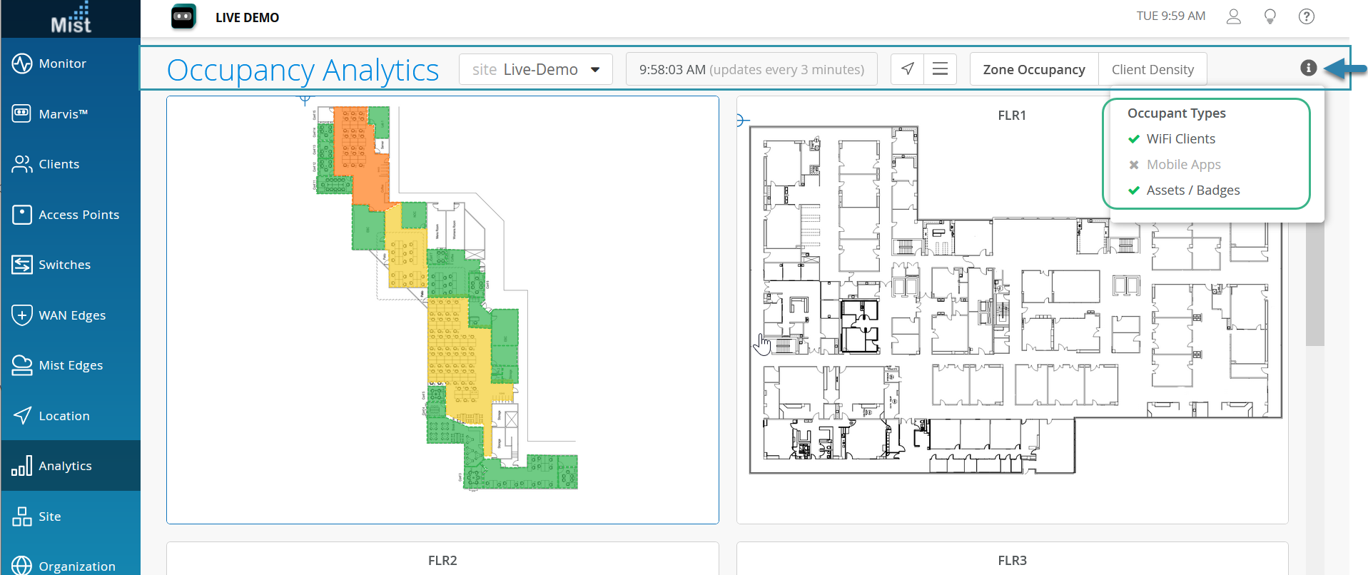
  2. Use the options available at the top of the dashboard to customize your view.
    Figure 2: Occupancy Analytics Occupancy Analytics
    • Site—Select site from drop-down.
    • Time—Time when the analytics data was last updated.
    • View—Toggle between the map view (arrow icon) and the table view (hamburger menu).
    • Zone Occupancy—See the occupancy in each zone of the selected site or floor. The zones are color-coded so that you can quickly identify the ratio of occupancy to capacity. For example, zones with low occupancy, that is below 50 percent of capacity, are in green. Zones with excess occupancy, that is over 100 percent of capacity, are in red.
    • Client Density—Identify the current occupancy across the floor plan. For example, the areas with the highest number of occupants are in red, and the areas with the fewest occupants are in blue.
    • Occupant Types—Select the types of clients to include in the occupancy count of each zone. The client types are:
      • WiFi Clients—Clients that are currently connected to the wireless network.

      • Mobile Apps—Clients that are using Juniper Mist SDK-enabled applications.

      • Assets/Badges—Bluetooth Low Energy (BLE) tags that you have attached to employee badges and high-value equipment.

View Zone Occupancy on a Heatmap

  1. On the Occupancy Analytics dashboard, select the site from the drop-down menu on the banner. The dashboard displays visuals of each floor of the site.
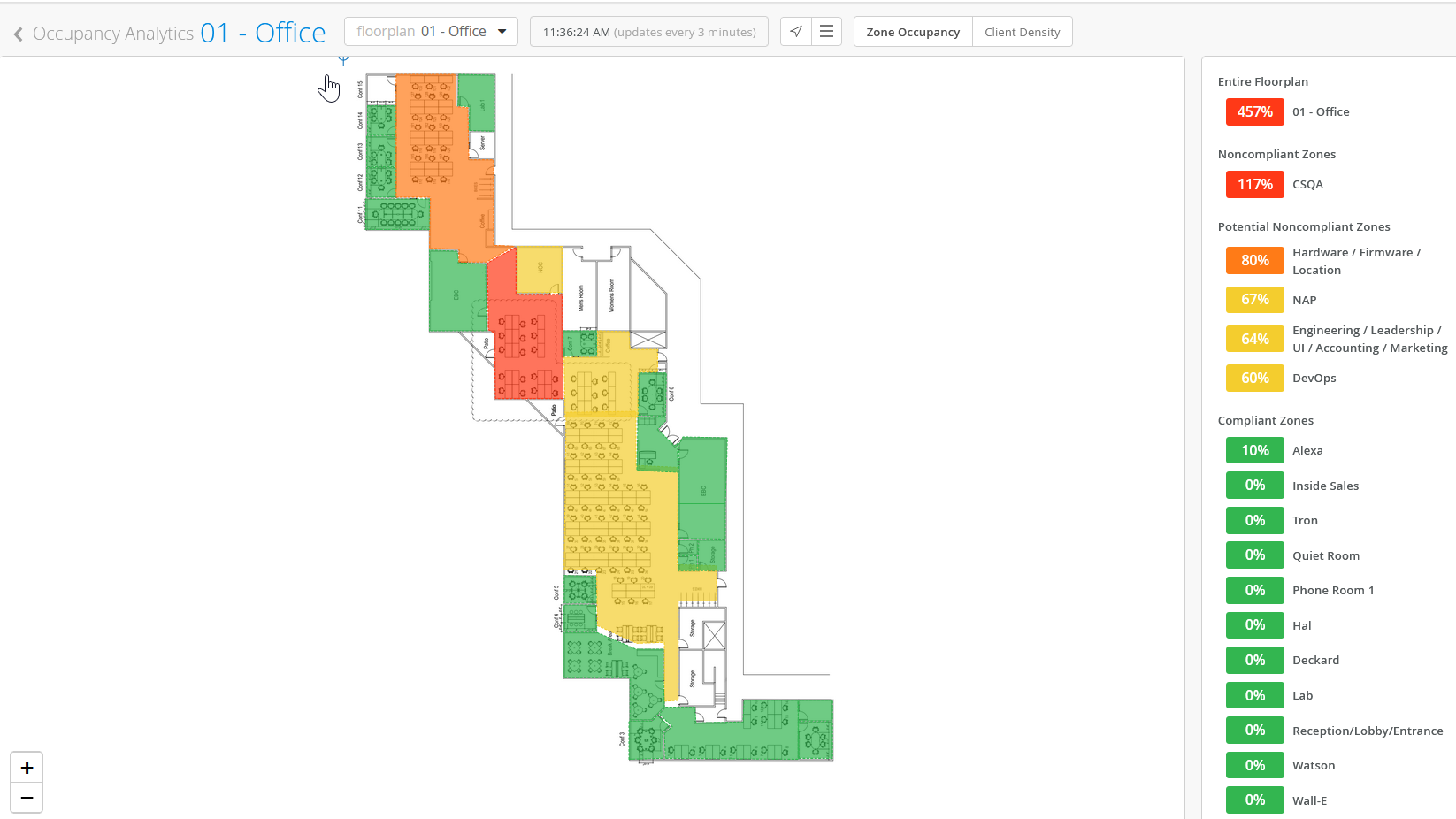
  2. Click a floor to see the details. On the dashboard, you see a heat-map of the floor occupancy. On the right pane, you see a list that displays the percentage of occupancy.
    Figure 3: Occupancy Details on a Heatmap Occupancy Details on a Heatmap

    You can quickly identify the percent of occupied capacity from the color-coded heatmap.

    • Green—Low occupancy, that is, below 50 percent of capacity.
    • Yellow—Occupancy is between 50 percent and 80 percent of capacity.
    • Orange—Occupancy is above 80 percent of capacity.
    • Red—Excess occupancy, that is, occupancy of over 100 percent of capacity.

    Click any zone in the heatmap or the list to see information only about that zone.

    Click any zone in the list to see the number of occupants and available capacity.

    Note:

    To edit the capacity limit, click the pencil icon, and then enter the maximum number of occupants.

View Zone Occupancy on a Table

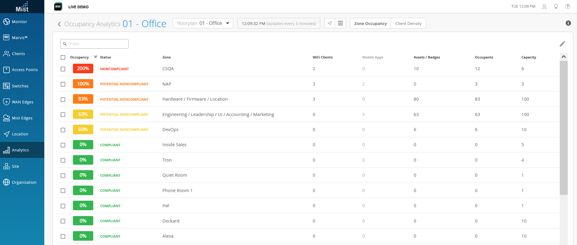
On the Occupancy Analytics dashboard, click the hamburger menu on the banner to see the details in a table.
Figure 4: Occupancy Details on a Table Occupancy Details on a Table

On the table, you can see:

  • Percentage representation of the occupancy to capacity ratio
  • Status of each zone displayed in terms of utilized capacity
    • Compliant—Low occupancy, that is, capacity utilization is below 50 percent.
    • Potential non-compliant—Occupancy is between 50 percent and 100 percent of capacity.
    • Non-compliant—Excess occupancy, that is, capacity utilization is over 100 percent.
  • Type of connected clients—Wireless, mobile application, assets, or badges
  • Number of occupants in each zone
  • Available capacity in each zone

To edit the capacity limit, click the pencil icon, and then enter the maximum number of occupants.

View Client Density Per Zone
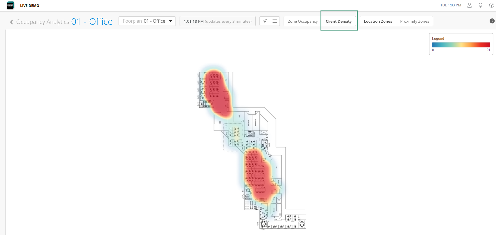
On the Occupancy Analytics dashboard banner, click Client Density to see the heatmap for client density.
Figure 5: Client Density Client Density

Use the legend on the right side of the page to get the number of clients on each zone.

Click the zoom in (+) and zoom out (–) icons to adjust the level of detail that you see on the heatmap.

Click the hamburger menu on the banner to see the details in a table.
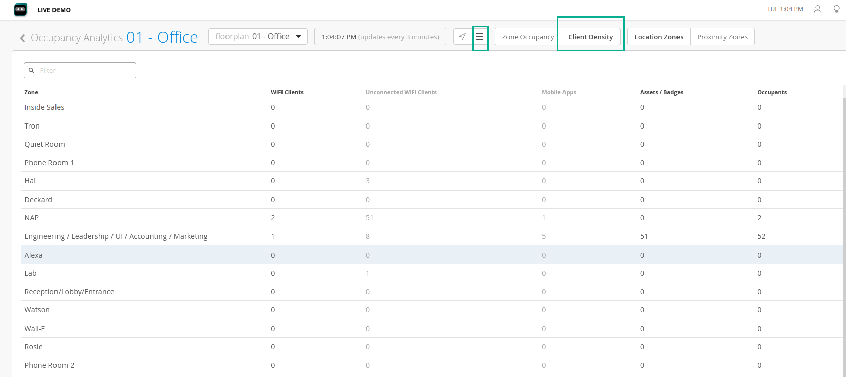
Figure 6: Client Density View as Table Client Density View as Table

You can identify the following information for each zone:

  • Type of connected clients—Wireless, mobile app, assets, and badges
  • Number of occupants

View Proximity Zone Details

View proximity zone information to gather occupancy and engagement data for SDK clients, named assets, and connected and unconnected wireless clients.
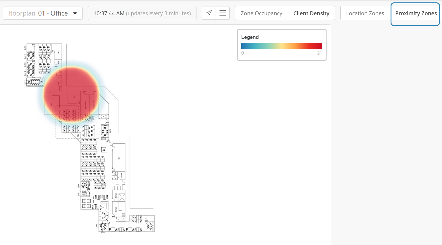
On the Occupancy Analytics dashboard, click Client Density and then click Proximity Zone.
Figure 7: Client Density View Client Density View

Use the legend on the right side of the dashboard to get the number of clients on each zone.

Click the zoom in (+) and zoom out (–) icons to adjust the level of detail that you see on the dashboard.

Click the hamburger menu on the banner to see the details in a table.

Figure 8: Proximity Zone Details Proximity Zone Details

You can identify the following information for each zone:

  • Type of connected clients (wireless, mobile application, assets, and badges)
  • Number of occupants