Utilization Legends
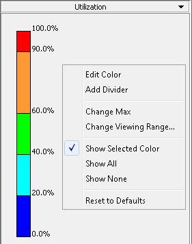
The Utilization displays the planned utilization rate of links resulting from the demands in the network model.
The Peak Util displays the links according to the peak utilization reached on that link in a failure simulation.
The Measured Link Util displays the measured link utilization, up to 24 periods. A slider bar can be used to check the utilization at different periods. The data comes from the ingress (interfaceLoad_in) or egress (interfaceLoad_out) files. For the live network this is named Interface CoS Util and uses the /u/wandl/data/.network/interface.traffic and interfacei.traffic files.
The Demand CoS Util displays the normal and peak utilization per CoS calculated based on demand routing. In this case, it is based off of both the demand and trafficload file. The trafficload file is used to display up to 24 periods. A slider bar can be used to check the utilization at different periods.

Popup Menu
Menu Item |
Description |
|---|---|
Edit Color |
This will open a color palette that allows you to choose a color for the section selected on the color slider. |
Add Divider |
This will add a new divider on the color bar at the location of the right-mouse-click. |
Change Max |
This will change the maximum utilization percentage on the color slider to the specified value in the New Max window. |
Change Viewing Range |
Use this to zoom into a particular percentage range, for example, 0.00-10.00% for greater granularity. |
Show Selected Color |
Selecting this option shows links that have the selected color. Note that when deselecting a color, a link is hidden only if the colors of both of its interfaces are deselected. |
Show All |
Shows links of any colors. |
Show None |
Hides all links. |
Reset to Defaults |
This will reset the Prov Util color bar to the original default setting of dividers and colors. |
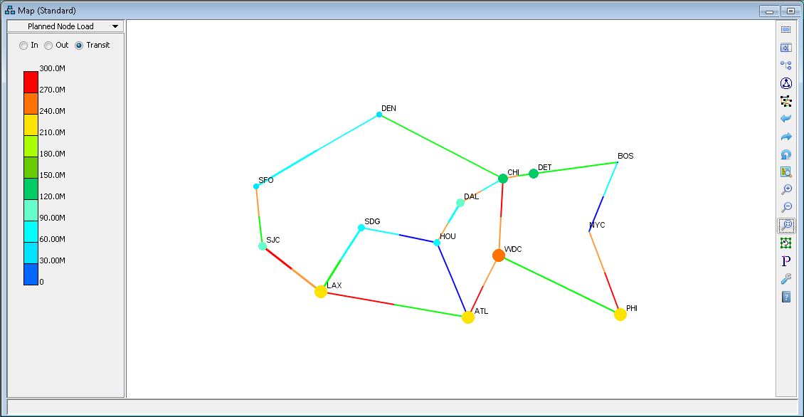
For the Planned Node Load and Measured Node Load panes, there is a color legend that colors the nodes according to the node load. The colors and divider locations can be modified in this legend.
The Planned Node Load pane allows you to view the planned load on each node based on the bandwidth of demands originating (Out), terminating (In) or passing through (Transit) each node.
The Measured Node Load pane allows you to view the measured load of traffic going in or out of the network. This option shows traffic derived from measurements at the incoming and outgoing interfaces. To use this feature, you should indicate in the specification file the location of the following files that specify the traffic going in/out of the node from interfaces: interfaceLoad_in (ingress), interfaceLoad_out (egress). See the NorthStar Planner Feature Guide for more details about these two panes.

The Node Load legend draws each node as a circle. The bigger the traffic going in/out of the node, the bigger the circle is, so you can easily see which nodes have the most traffic to the outside world. For Measured Node Load, there is also a slider to choose one of up to 24 periods to display.
For MPLS-enabled networks, you will see a different view depending upon whether Layer 2 or Layer 3 is selected from the top menu bar of the main window. Selecting Layer 2 allows you to view the planned load of LSP Tunnels.
