Topology Map Color Legend
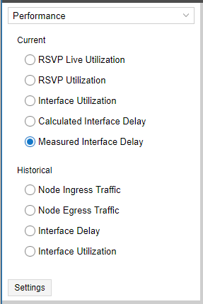
In the lower left corner of the topology map pane, there is a color legend for the links displayed in the map. The title of the legend and the units it represents (percent, milliseconds, megabytes) correspond to the display option you select in the Performance window in the left pane, shown in Figure 1.
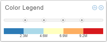
Click the legend to enlarge it and enable configuration as shown in Figure 2.
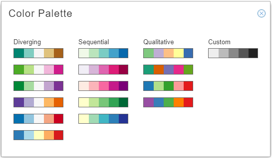
Click the triangle icon in the upper right corner to open the color palette where you can choose a color scheme. The color scheme options are designed to support any network visualization goals, including a create-your-own-palette option (Custom). Figure 3 shows the color palette options.
Double click in one segment on the Custom palette to open the custom color window where you can select a color for that segment. Figure 4 shows the custom color window.
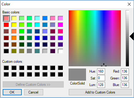
Click OK to add the color to the palette. Double click another segment, and so on until you have selected all five colors for the Custom palette. If you save a layout, the active palette is saved with the layout, even if it is a custom palette.
The ranges represented in the color legend are configurable. Click and drag the slider buttons between colors on the legend to change the ranges. The links in the topology map change color accordingly. The max value option (gear icon) appears in the upper right corner of the legend when your Performance selection (left pane) calls for units other than a percentage. Click the gear icon to set the maximum value for the legend.
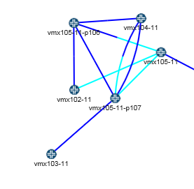
Sometimes links display as half one color and half another color. The presence of two different colors indicates that the utilization in one direction (A to Z) is different from the utilization in the other direction (Z to A). The half of the link originating from a certain node is colored according to the link utilization in the direction from that node to the other node. Figure 5 shows two colors in one of the links between vmx104-11 and vmx105-11-p107.
