Left Pane Options
The left pane drop-down menu offers several ways to filter the data that is displayed in the NorthStar Controller topology map pane, as well as several views related to status and network properties. When you first log in to the web user interface, the initial view shows Network Status. Table 1 summarizes the left pane drop-down menu choices.
Option |
Description |
|---|---|
Network Status |
Displays a summary of the current status of network elements. |
Timeline |
Displays a list of timestamped network events. You can use filtering to narrow the display to specific types of event. This information can be useful for debugging purposes. |
Types |
Lists node types you can opt to display or hide on the topology map. |
Nodes/Groups |
Displays user-created groups with or without listing the member nodes. Expanded groups are represented on the topology map by individual node icons. Collapsed groups are represented on the topology map by group icons, and the individual member nodes are not displayed. All nodes start out as ungrouped. |
Performance |
Current (live network) and historical groups of performance options. |
Protocols |
Selects protocols to include in the topology map. Nodes configured with selected protocols are displayed. The default option includes all protocols. |
AS |
Selects autonomous systems (ASs) to include in the topology map. |
ISIS Areas |
Selects ISIS areas to include in the topology map. |
OSPF Areas |
Selects OSPF areas to include in the topology map. |
Path Optimization Status |
Displays path optimization statistics and information. |
Link Coloring |
Provides bit-level link coloring. |
Layers |
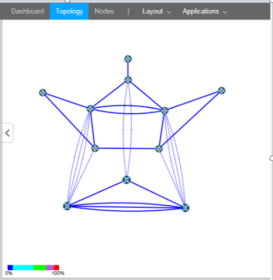
Reflects the multilayer feature. If you have a multilayer license, information can be displayed that has been parsed from Transport Layer vendors. The topology map shows interlayer links between nodes as dotted lines. |
The following sections describe the left pane display options:
Network Status
Figure 1 shows an example of the Network Status display in the left side pane of the Topology view. Network Status is the view that is displayed in the left pane when you first launch the NorthStar Controller application.
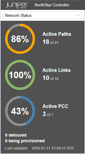
The panel displays the percentage and count of the network’s active paths, active links, and active PCCs that are in an UP state. The display is updated every one to two minutes, depending on the frequency of incoming events. The busier the network, the more frequent the update.
The number of paths detoured and LSPs in the process of being provisioned are also noted. Detoured paths are those using a bypass LSP.
These numbers could differ from what is reported in the network information table:
Active Paths: by design, the Active Paths reported in the Network Status display is not the same as what is reported in the Tunnel tab of the network information table because the Tunnel tab includes secondary paths and the Active Paths display does not. If you have a secondary path for any LSPs, the Active Paths display and the Tunnel tab in the network information table do not match.
Active Links: should always match the Link tab in the network information table if the internal model is in sync with the live network. If they don’t match, it can be a symptom that the internal model has become out of sync with the live network. On a regular basis, when the internal model is updated, it is with changes to the live network topology, not with a rebuilding of the entire topology. So over time, the model and the live network can become out of sync. To correct this problem, replenish the internal model with the entire live network information using Sync Network Model under Administration > System Settings.
Active PCC: by design, the Active PCC reported in the Network Status display is not the same as what is reported in the Node tab of the network information table because the Node tab includes pseudo nodes and the Active PCC display does not. The Active PCC display only includes nodes that are routers; it does not include pseudo nodes such as Ethernet nodes or AS nodes. If you have pseudo nodes in the network, the Active PCC display and the Node tab in the network information table do not match.
Timeline
Figure 2 shows an example of the Timeline display in the left side pane of the Topology view.
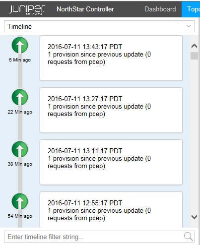
The timeline lists activities and status checkpoints with the most recent notations first.
You can use the Timeline to track chronological events as they occur in the network, in order to take appropriate action in real time. You can also use the scroll bar to view past network activities, going back as far as needed.
You can use the filtering box at the bottom of the pane to narrow the display to specific types of event, or to events associated with a specific day or time.
When the timeline is not current, a message is displayed at the top of the Timeline pane inviting you to “click here” to update the display.
You can assess the stability of the MPLS network by tracking changes in the number of LSP Up and Down events over time. You can then analyze whether the occurrence of specific other events affects the number of LSP Up and Down events.
The following event types are included in the Timeline:
Related to nodes:
PCEP session goes Down
PCEP session goes Up
PCEP session becomes ACTIVE
Related to links:
Link goes Up
Link goes Down
Related to LSPs:
Change in the number of LSPs that are Up
Change in the number of LSPs that are Down
Change in the number of LSPs that are being provisioned
Related to NorthStar Controller:
Path optimization start and end times
Maintenance events start and end times
Types
The Types list in the left pane of the Topology view includes categories of nodes and links found in the network. Figure 3 shows a sample Types list.
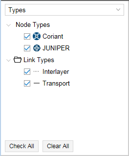
Different types are associated with different icons, which are reflected in the topology map. The example shown in Figure 3 includes transport and interlayer link types associated with the Coriant transport controller vendor.
You can select or deselect a type by checking or clearing the check box beside it. Only selected options are displayed in the topology map. Click Check All to select all check boxes; click Clear All to clear all check boxes.
You can right-click on a node type and select Properties to choose the icon that will represent that node type in the topology map. You can also upload your own icon from there.
Figure 4 shows the icon selection window.
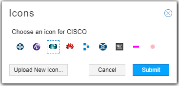
All nodes of one type use the same icon.
Nodes/Groups
You can create groups of nodes using the topology map and the Layout menu. Once you have groups in your topology, the Groups list in the left pane of the Topology view shows all your node groups, and lists all nodes not included in any group under the heading UNGROUPED.
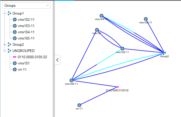
When you expand a group listing using the plus (+) sign next to the group name, all the member nodes are listed. When you collapse a group listing using the minus sign (-), only the group name appears. In Figure 5, Group1 and UNGROUPED are expanded, and Group 2 is collapsed.
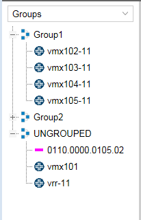
The topology map reflects the expansion and collapse of the groups in the groups list. For an expanded group, all individual nodes are displayed in the topology map, without indication of which group they belong to. For a collapsed group, the individual node icons are collectively represented by a group icon. Hover over or click on the group icon in the map to display the group name. If you collapse UNGROUPED in the Groups list, the nodes disappear from the topology map. Figure 6 shows the arrangement from Figure 5 along with the corresponding topology map.
Performance
Under Performance, you have the option to display on the topology map current (live network) or historical (analytic traffic collection) data as shown in Figure 7.
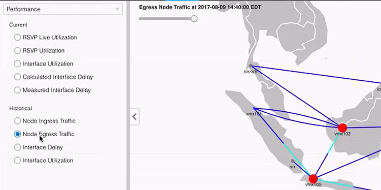
Click the radio button for the option you want displayed on the topology map. You can only have one option selected at a time. The color legend at the bottom of the topology map changes to correspond with your selection. See Topology Map Color Legend for information about customizing the legend.
For the historical options, there is a slide bar in the upper left corner of the map, visible in Figure 7. See Viewing Analytics Data in the Web UI for more information about how to use this feature to help visualize and interpret analytics data. Click Settings at the bottom of the Performance options window to select the amount of historical data to load.
Protocols
The Protocols list includes all protocols present in the current topology. Figure 8 shows an example.
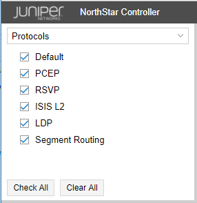
Protocols can be selected or deselected by selecting or clearing the corresponding check boxes. Only network elements that support selected protocols are displayed in the topology map.
Select Default to display all protocols on the topology map. If you do not want elements supporting all protocols to be displayed on the topology map, be sure to clear the Default check box.
Click Check All to select all check boxes; click Clear All to clear all check boxes.
AS
The autonomous systems (AS) list assigns a color, for purposes of representation on the topology map, for each AS number configured in the network. In Figure 9, routers configured with AS 65011 appear on the topology map as red dots. NONE shows the color assigned to routers with no AS configured.
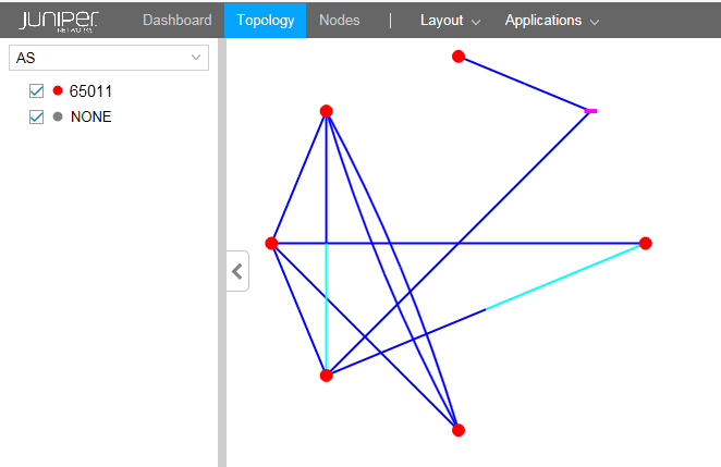
Select or deselect AS numbers by selecting or clearing the corresponding check boxes. Only selected AS numbers are displayed in the topology map.
Click Check All to select all check boxes; click Clear All to clear all check boxes.
ISIS Areas
The ISIS Areas list assigns a color, for purposes of representation on the topology map, for each IS-IS area identifier configured in the network. The area identifier is the first three bytes of the ISO network entity title (NET) address. In Figure 10, routers whose NET addresses include area identifier 11.0007 appear on the topology map as red dots. Those with area identifier 49.0011 appear as green dots. NONE shows the color assigned to routers with no NET address configured.
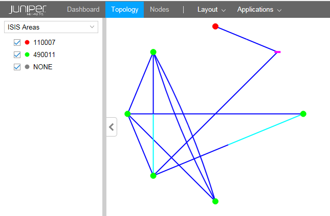
ISIS area identifiers can be selected or deselected by checking or clearing the corresponding check boxes. Only selected area identifiers are displayed in the topology map.
Click Check All to select all check boxes; click Clear All to clear all check boxes.
OSPF Areas
The OSPF Areas list assigns a color, for purposes of representation on the topology map, for each OSPF area configured in the network. NONE shows the color assigned to routers with no OSPF area configured.
In Figure 11, routers with OSPF area 0 configured appear on the topology map as red dots. Those with OSPF area 1 appear as green dots. NONE shows the color assigned to routers with no OSPF area configured.
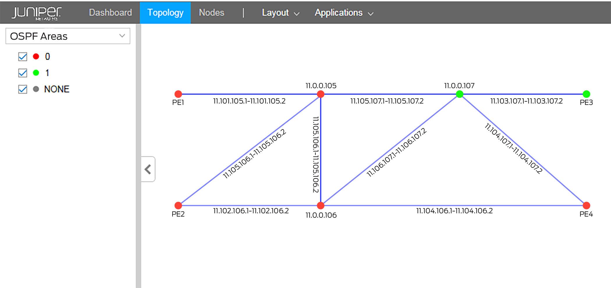
Select or deselect OSPF areas by selecting or clearing the corresponding check boxes. Only selected areas are displayed in the topology map.
Click Check All to select all check boxes; click Clear All to clear all check boxes.
Path Optimization Status
Figure 12 shows an example of the Path Optimization Status display in the left side pane of the Topology view.
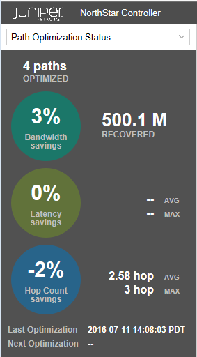
Displays path optimization statistics and information, such as the number of paths that were last optimized, the percent of bandwidth savings achieved, the percent hop count savings, and the time and date of the next optimization if one is scheduled.
Link Coloring
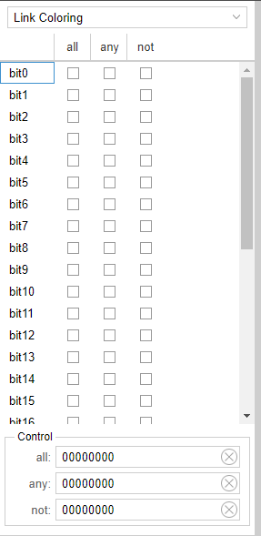
This option offers bit-level link coloring as shown in Figure 13.
Layers
The Layers list gives you the option to exclude or include individual layer information in the topology map.
Figure 14 shows an example of the Layers list with IP and transport layer options.
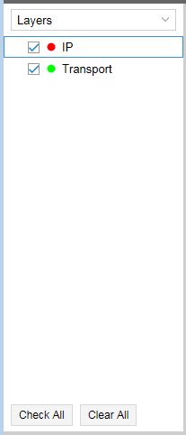
Use the Layers list to select the layers (IP or Transport or both) that you want to display. If you are not using the Multilayer feature, the Layers list contains only IP and is not an applicable filter.
Click Check All to select all check boxes; click Clear All to clear all check boxes.
Figure 15 shows an example of a topology map that includes both IP Layer and Transport Layer elements. The dotted link lines indicate interlayer links.
