RF Health and Utilization
Use the RF Health and Utilization dashboard to understand long-term radio frequency (RF) health and utilization patterns for your network.
With the information on this dashboard, you can analyze channel utilization trends for different radio bands across various sites, floors, and access points (APs), ensuring optimal performance and capacity planning.
Watch Juniper Mist Premium Analytics: RF Health Utilization for more details.
Features and Benefits
-
Provides insights into channel utilization breakdown, identifying traffic, background noise, and interface sources, empowering you to optimize network resources.
-
Provides information to detect the worst DFS channels affected by radars, understand radar patterns, and proactively mitigate interference maintaining a reliable wireless network.
Before You Begin
- Familiarize with the options available on your dashboard. See Figure 3.
-
See Juniper Mist Wireless Configuration Guide for wireless configuration details.
-
You need a license for using the Juniper Mist Premium Analytics dashboard. See Mist Premium Analytics Trial License for more information.
Access RF Health and Utilization Dashboard
To access the RF Health and Utilization dashboard:
RF Health and Utilization Tiles
- SLE - Coverage and Capacity
- SLE by Site(s)
- Total Wired Traffic
- Total RF Traffic
- Busiest APs
- Total Retries
- Average Channel Utilization by Site(s)
- Channel Utilization Breakup
- RRM Insights
- Co-Channel Neighbors
- Busiest Clients and Roaming Behavior
SLE - Coverage and Capacity
The Traffic by AP tile shows charts for SLE metrics—coverage and capacity—for the selected duration.
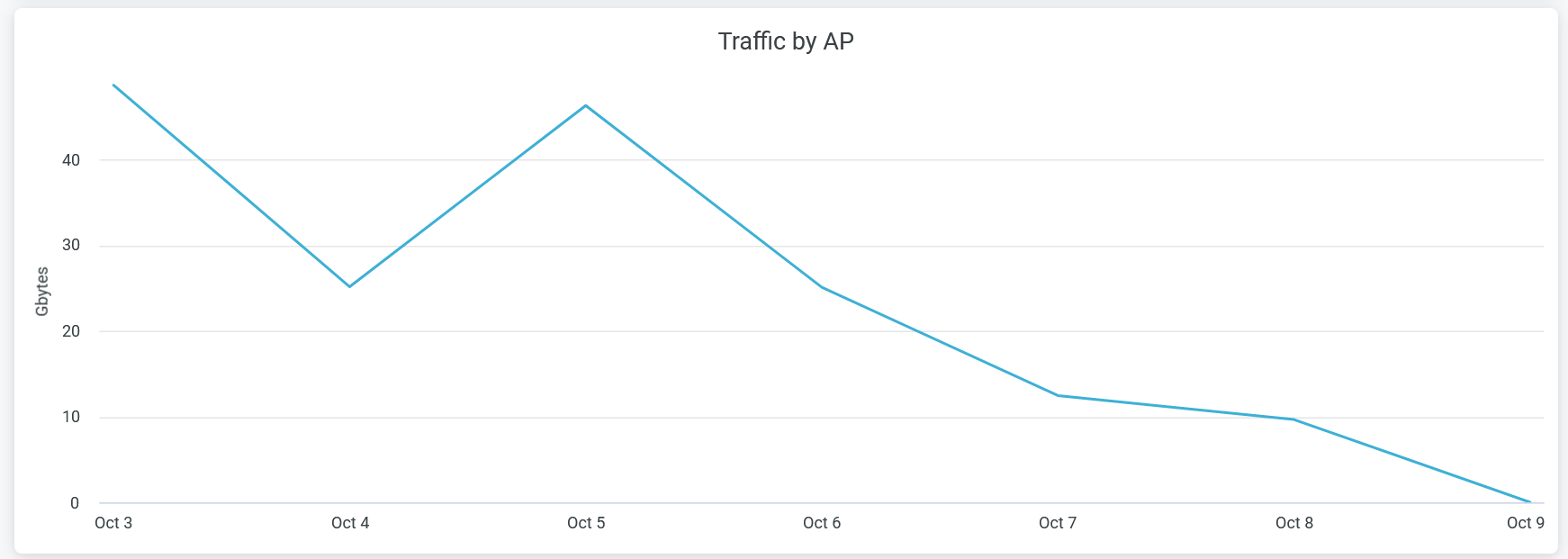
The Juniper Mist portal displays each SLE metric as a percentage that represents the success rate of the metric.
- Coverage—Identifies the number of user minutes that a client’s received signal strength indicator (RSSI), as measured by the access point, are within the configured threshold.
- Capacity—Tracks the user minutes that a client experiences low capacity because of interference, number of attached clients, and usage by the attached clients.
You can hide one of these graphs by clicking the name in the legend below the chart.
SLE by Site(s)
The tile shows charts lists sites with SLE metrics - coverage and capacity for the selected duration.

The tile displays coverage and capacity SLE metrics for each site. Juniper Mist displays percentage that represents the success rate of the metric.
In the above sample, 100 percent of the devices in the Westford site and 90.7 percent of the devices in the Live-Demo site experience the expected level of network capacity.
According to the sample, 100 percent of the devices in the Westford site and 80.2 percent of the devices in the Live-Demo site experience the expected level of coverage.
Total Wired Traffic
The Clients by AP tile shows wired network traffic in the site for the selected period.
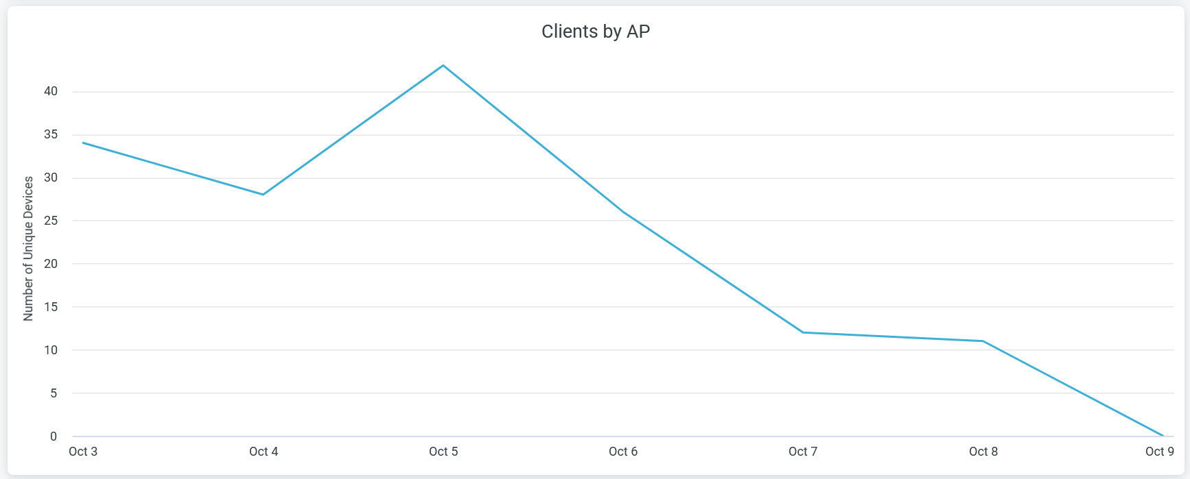
Hover over the chart to view the volume of traffic at a given time.
Total RF Traffic
The Total RF Traffic tile shows RF-based traffic in the site for the selected period. The details include usage by the 2.4-GHz, 5-GHz, and 6-GHz bands.

You can see three lines in the chart each representing 2.4-gigahertz (GHz), 5-GHz, and 6-GHz bands. Place the cursor on the chart to see the traffic volume for the selected band. You can hide one of these three graphs by clicking the name in the legend below the chart.
Busiest APs
The tile displays the most active APs in the network, ranked according to their traffic usage.
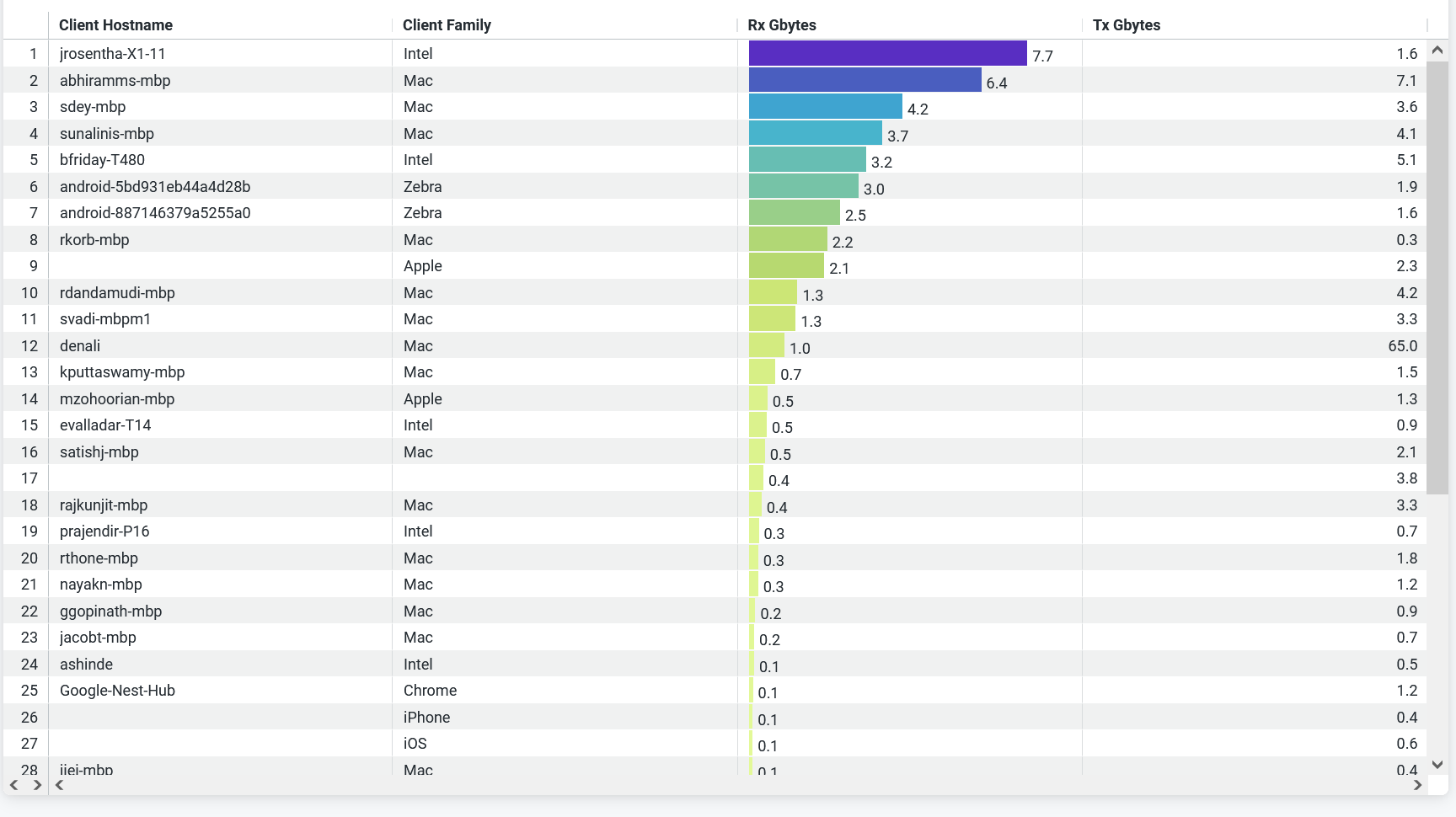
You can view on the tile:
- AP name—Name of the AP.
- Site Name—Name of the site that an AP is associated with.
- GBytes—Traffic volume on an AP.
- Tx Gbytes (Gbps)— Received traffic volume.
- Rx Gbytes (Gbps)—Transmitted traffic volume.
Total Retries
The tile displays the data transmission and reception retry attempts by a wireless device.
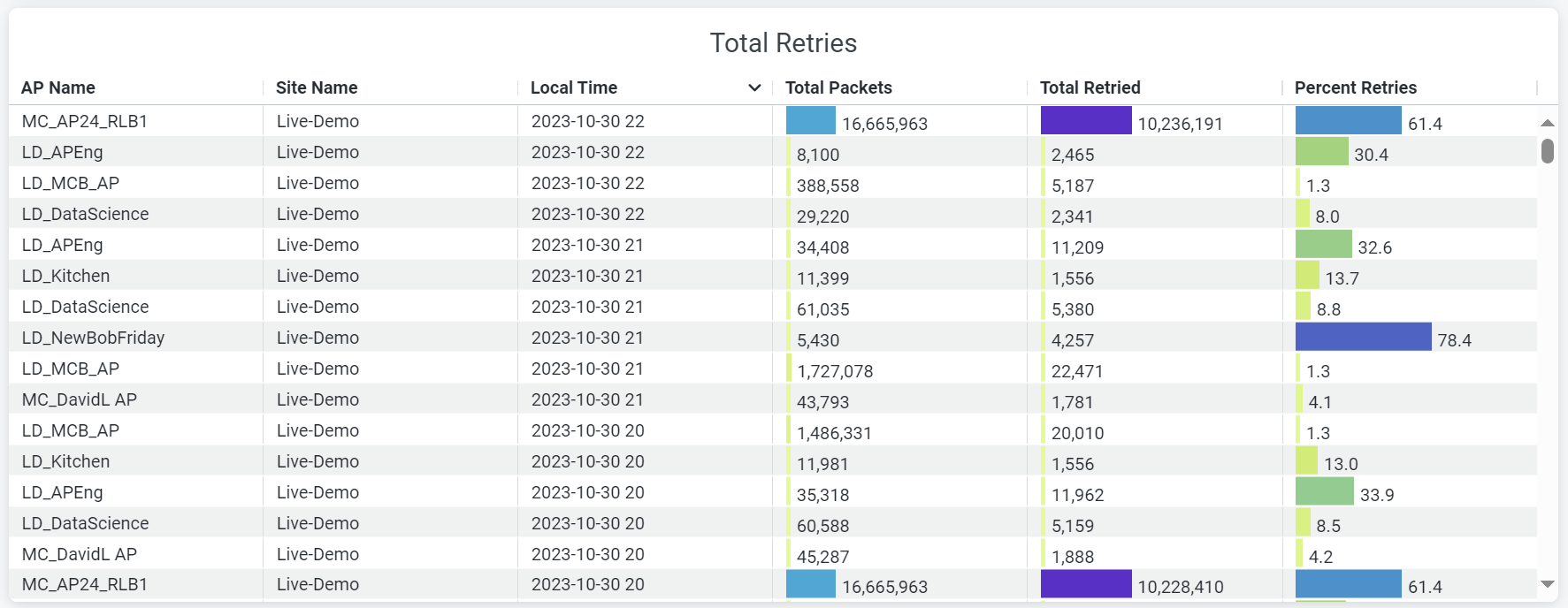
Wireless retry refers to the instances when data frames must be retransmitted between a client and an AP due to an error. s On the Total Retries tile, you can view:
- AP name—Name of the AP.
- Site Name—Name of the site with which an AP is associated.
- Local time—Timestamp of the data.
- Total Packets—Volume of traffic flow through an AP.
- Total Retried—Volume of retried-traffic flow through an AP.
- Percent Retried—Percentage of retried-traffic through an AP.
Average Channel Utilization by Site(s)
The tile displays the percentage of channel utilization trends in the 2.4-GHz, 5-GHz, and 6-GHz radio channels grouped by sites.

In the preceding sample, the Live-Demo site uses 0.17 percent of the 2.4-GHz channel, 23.47 percent of the 5-GHz channel, and 4.06 percent of 6-GHz channel.
Channel Utilization Breakup
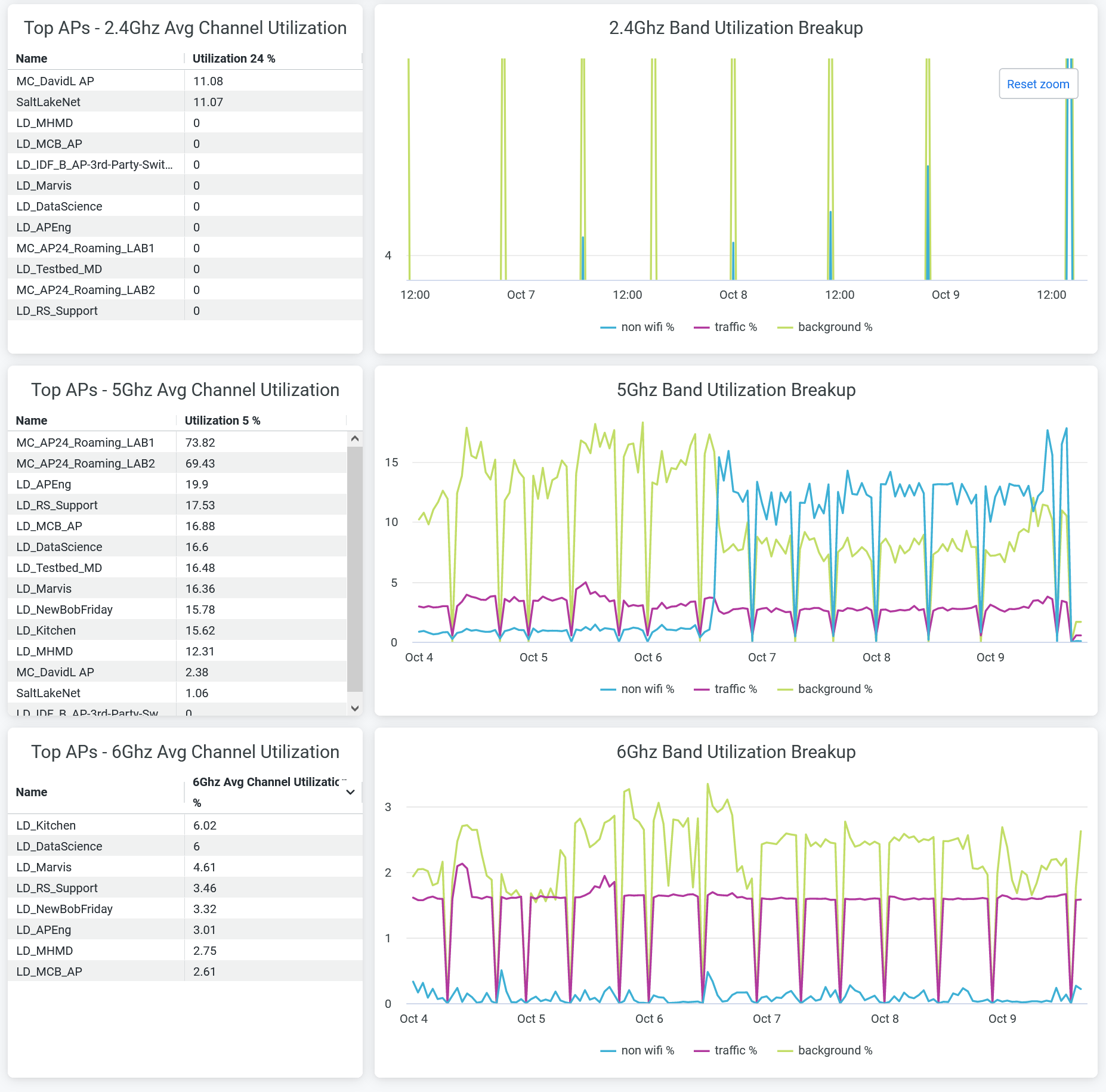
You can view:
- Top APs - 2.4Ghz, 5Ghz, and 6Ghz Avg Channel Utilization—List of top APs sorted by the percentage of channel utilization in each band.
- 2.4Ghz, 5Ghz, and 6Ghz Band Utilization Breakup—Band utilization trend by non-wireless client traffic, wireless client traffic, and background. Hover over the chart to view the exact percentage of channel utilization.
RRM Insights
The tile displays Radio Resource Management (RRM) events per site.
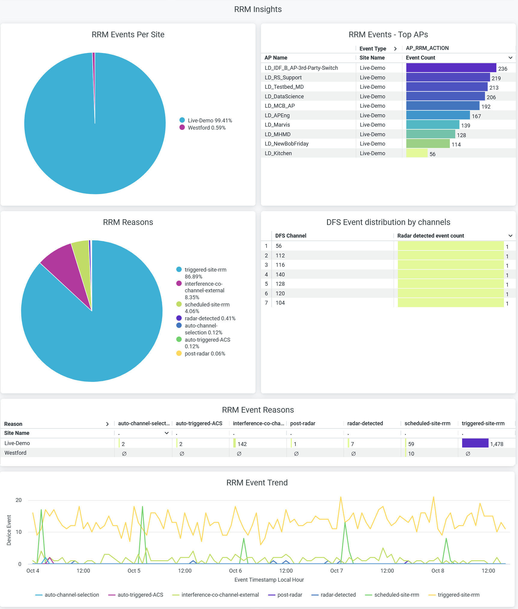
RRM continuously optimizes wireless coverage and capacity across an entire site, for example to maintain SLEs. Channel and power level changes on a single AP are triggered when an RRM event occurs. The reasons for triggering an RRM event include scheduled RRM, co-channel interference, radar detection, and many more.
- RRM Events per Site—Percentage of RRM event distribution per site.
- RRM Events Top APs—List of APs ranked by the number of RRM events.
- RRM Reasons—Percentage of each RRM event reasons. You can place the cursor on a wedge in the pie chart to see the exact percentage of each RRM-event reason. You can see the percentage of RRM-event reasons in the legend. To hide data for an RRM-event reason and see data for only the remaining reasons, click the reason in the legend.
- DFS Event Distribution by Channel—Radar-detected event count for each dynamic frequency selection (DFS) channel.
- RRM Event Reasons—Numbers of RRM event reasons per site.
- RRM Event Trend—RRM event trends classified by the reasons. Place your cursor on a point in a line graph to see the exact number of an RRM-event reason with the event time stamp. To hide information about a reason from the chart and see information only about the remaining reasons, click the reason name in the legend.
Co-Channel Neighbors
The tiles display average number of neighboring APs and co-channel APs.
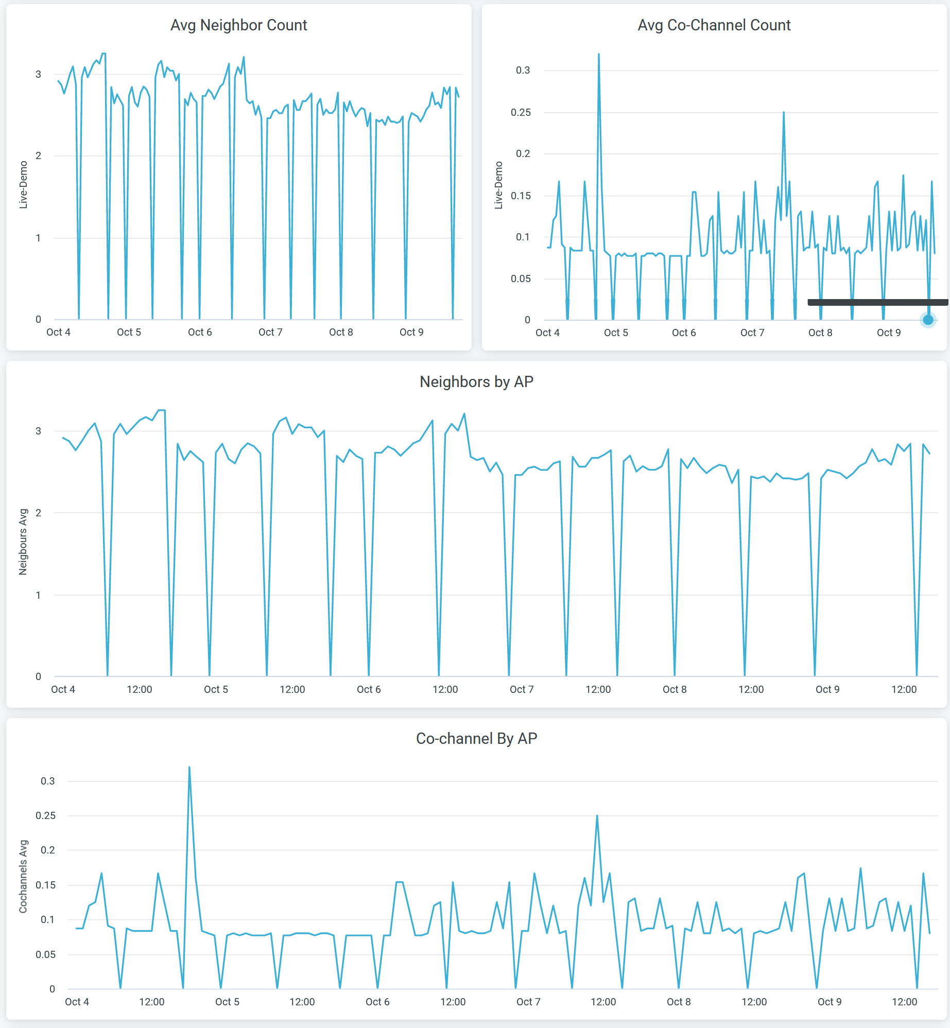
You can view:
- Avg Neighbor Count—Average number of Juniper APs in the site that are hearing each other on the selected radio band.
- Avg Co-Channel Count—Average number of APs that are broadcasting the same channel in the site. It is the average for all Juniper AP in the site.
- Neighbors by AP—Average number of neighbor Juniper APs in the organization that are hearing each other on the selected the radio band.
- Co-channel By AP—Average number of APs that are broadcasting the same channel. It is the average for all Juniper AP in the organization.
Busiest Clients and Roaming Behavior
The tile displays the list of client devices with details. The tile orders the client devices based on the traffic volume.
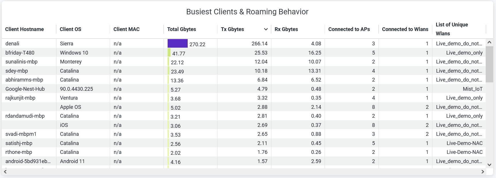
- Client Hostname—Hostname of a client.
- Client OS—Operating system running on a client device.
- Client MAC—MAC address of a client device.
- AP Name—Name of the AP to which a client device is connected.
- RX Gbytes—Traffic volume that a client receives.
- TX Gbytes—Traffic volume that a client transmits.
- Connected to WLANs—Number of associated WLANs.
- List of Unique WLANs—Names of WLANs.

