Wireless Network Insights
Get a comprehensive analysis of your wireless network performance.
The Wireless Network Insights dashboard provides end-to-end visibility of your wireless network. You can view network performance, traffic throughput, application usage, and connected device details. You can see in-depth information including service-level expectation (SLE) trends, client distribution, band and application usage, and client device information.
Features and Benefits
-
Generates insights about organization-wide client session trends and session distribution by site, wireless LAN (WLAN), access point (AP), client type, and operating system (OS). With these insights, you can spot the network areas that experience problems.
-
Reports on network device health, performance, and status.
-
Provides data on the amount and types of traffic passing through the network.
-
Reports on the clients attached to the network along with client health and traffic information.
-
Gives visibility to the devices and applications that use the network's bandwidth.
Before you Begin
- Familiarize with the options available on your dashboard. See Figure 3.
-
See Juniper Mist Wireless Configuration Guide for wireless configuration details.
-
You need a license for using the Juniper Mist Premium Analytics dashboard. See Mist Premium Analytics Trial License.
Access Wireless Network Insights Dashboard
To access the Wireless Network Insights dashboard:
-
In the Premium Analytics page, click Wireless Network
Insights.
Figure 1: Access Premium Analytics
 The Wireless Network Insights page appears.
Wireless Network Insights Tiles
The dashboard displays the volume of traffic flow, number connected devices, and client traffic through service set identifiers (SSIDs).
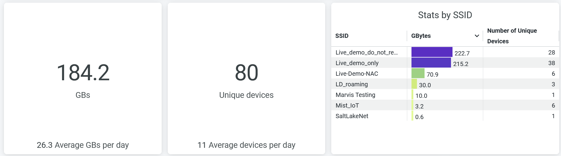
The Wireless Network Insights dashboard includes various tiles that provide graphical representations of analytics at a granular level. On the tiles, you can see the number of connected clients and information about applications, sites, APs that support the highest number of client sessions, and other network performance metrics.
- Service Level Expectations(SLE)
- Traffic by SSID( rx/tx)
- Top Applications
- Trend for Connected Devices
- Trend Application (Rx/Tx)
- Trend by OS
- Application by Clients
- Application by Rx/Tx
- Devices by Family
- Top APs
- Client Distribution by Protocol
- Client Distribution by Bands
- Top 25 Sites by Connected Devices
Service Level Expectations(SLE)
Figure 3 shows the Service Level Expectations (SLE) tile.
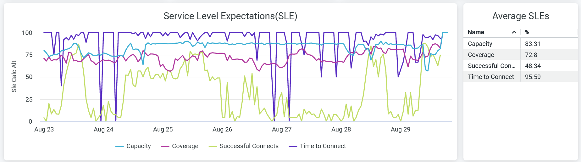
The tile displays the performance of each of the following SLE metrics as a percentage that represents the success rate of the metric:
-
Time to Connect—Percentage of successful connections established with the Internet within the specified threshold time.
-
Successful Connects—Percentage of successful connections (initial, roaming, and ongoing).
-
Coverage—Percentage of user minutes for which a client’s received signal strength indicator (RSSI), as measured by the access point (AP), matches the SLE goal.
-
Capacity—Percentage of user minutes for which a client experiences a good coverage. The capacity depends on factors such as interference, number of attached clients, and usage by attached clients.
Hover over the chart to see the actual values of the metric at a given time.
Traffic by SSID( rx/tx)
Figure 4 shows the Traffic by SSID ( rx/tx) tile.
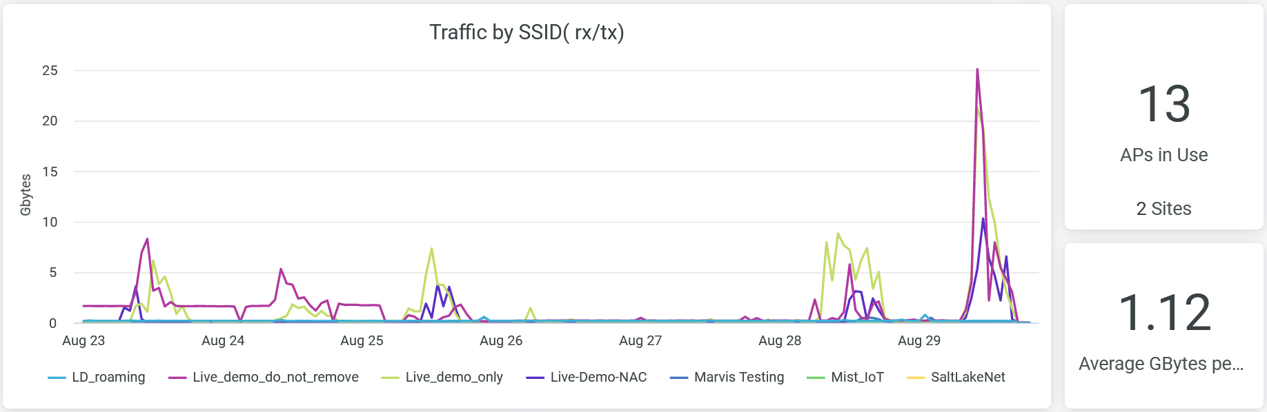
On the tile, you can see transmitted and received client traffic by each SSID over a period of time. To hide data for an SSID from the chart and see data for only the remaining SSIDs, click the SSID name in the legend.
On the tile, you can also see the total number of APs in use and the average traffic volume per hour. Hover over the chart to view the volume of traffic at a given time by a particular SSID.
Top Applications
Figure 5 shows the Top Applications by Devices and Top Applications by Tx/Rx Bytes tiles.
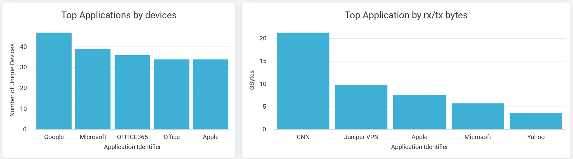
The Top Applications by devices tile provides the number of client devices connected to each of the applications. Place the cursor on a bar in the chart to see the exact number of client devices using a particular application. To hide data for an application and see data for only the remaining applications, click the application name in the legend below the chart.
The Top Applications by Rx/Tx Bytes tile provides information about the traffic that applications or websites receive and transmit. Hover over the chart to see the client traffic and data usage for the particular application or website.
Trend for Connected Devices
Figure 6 shows the Trend for Connected Devices tile.
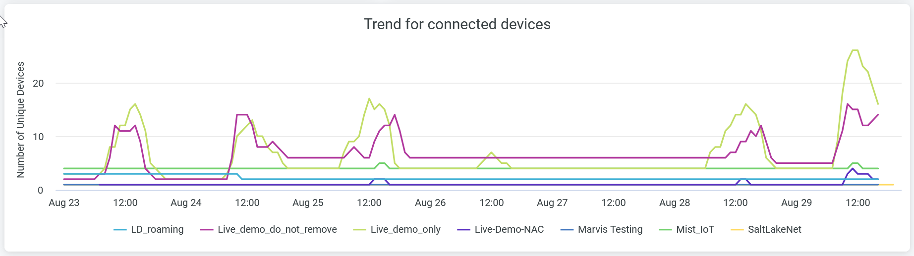
The tile provides the trend that Juniper Mist sees over a period of time among the client devices that have connected to SSIDs.
Place the cursor on the chart to see the number of client devices connected to a particular SSID at a given time.
To hide data for an SSID and see data for only the remaining SSIDs, click the SSID name in the legend below the chart.
Trend Application (Rx/Tx)
Figure 7 shows the Trend Application (Rx/Tx) tile.
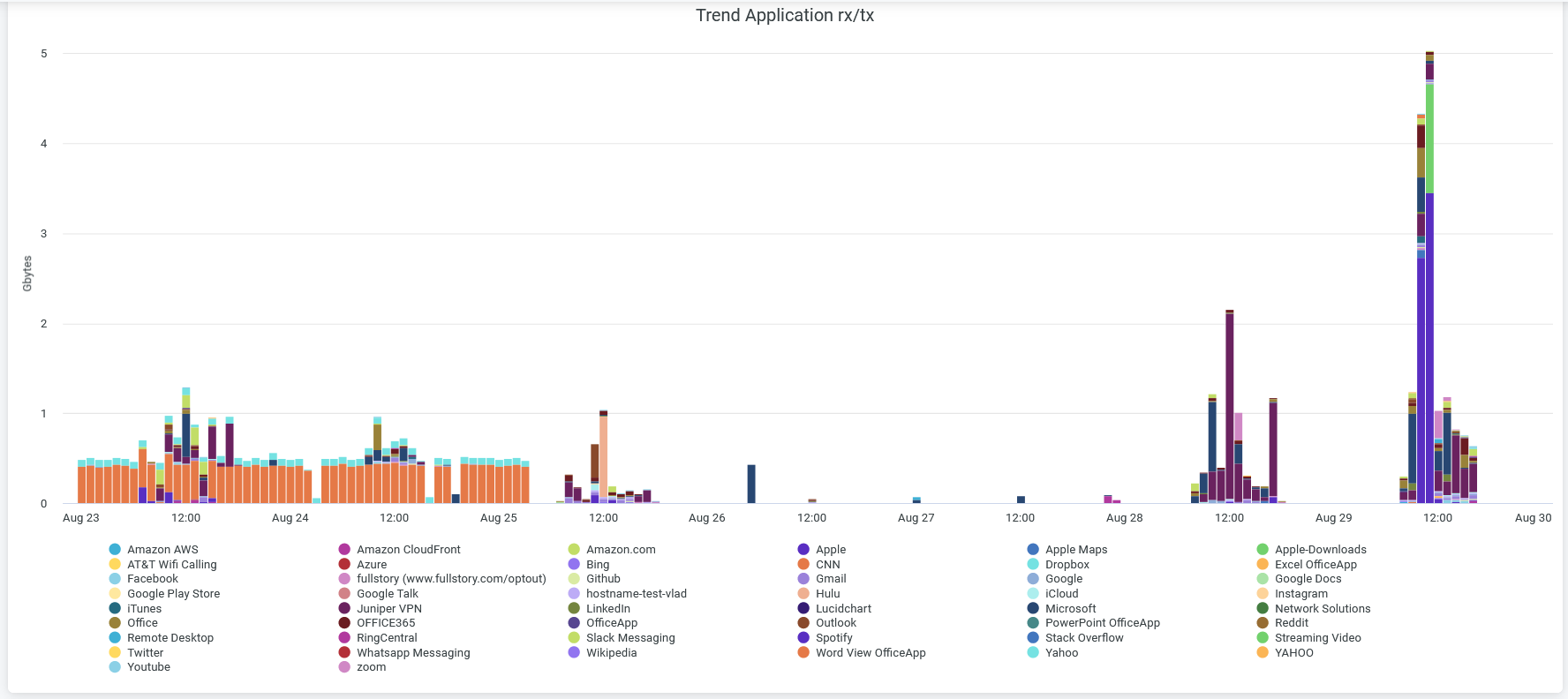
The tile provides trends that Juniper Mist sees over a period of time in the traffic that the applications receive and transmit and the application usage patterns.
You can place the cursor on a bar in the chart to see the application name and the volume of client traffic that the application receives and transmits at a specific time.
When you click an application in the chart, the system displays the client device that uses the application and the application usage in gigabytes (GB) in a new window. You can download the table/graph using Download option.
Trend by OS
Figure 8 shows the Trend by OS tile.
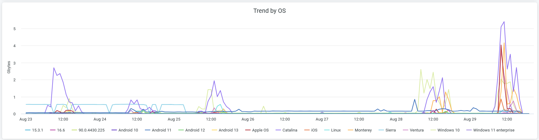
The tile displays the trend that Juniper Mist sees over a period of time among the connected client devices that run on various operating systems.
Place the cursor on a point in any line graph to see the number of devices that run on the same operating system. To hide data about an operating system from the chart and see data for only the remaining operating systems, click the operating system name in the legend.
Application by Clients
Figure 9 shows the Application by Clients tile.
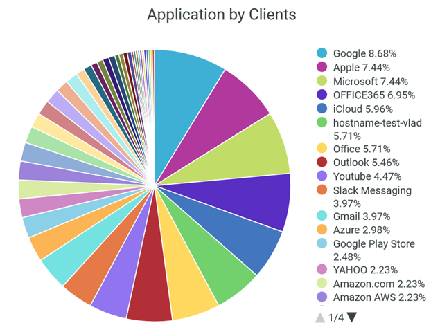
The tile displays the usage percentage of each application by the client devices.
You can place the cursor on a wedge in the pie chart to see the number of client devices connected to an application.
Click a wedge, which represents an application, in the pie chart to view the list of client devices that use the application and the application usage (in GB). You can view this information as a graph or as a table. You can click Download to download the table or the graph.
You can see the percentage of traffic to an application in the legend. You can see the percentage of traffic to an application by using the legend below the chart. To hide data for an application and see data for only the remaining applications, click the application name in the legend.
Application by Rx/Tx
Figure 10 shows the Application by Rx/Tx tile.
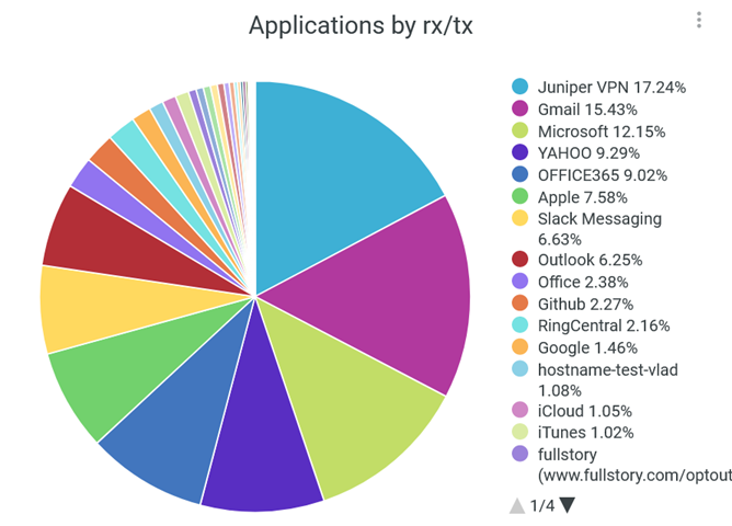
The tile displays the percentages of client traffic volume that each application or website receives and transmits.
Place the cursor on a wedge in the pie chart to see the volume of traffic that application or website receives and transmits.
Click a wedge, which represents an application, in the pie chart to view in a new window the percentage of traffic volume that the application receives and transmit. You can view this information as a graph or as a table. You can click Download to download the table or the graph.
You can also see in the legend the percentage of traffic that an application receives and transmits. To hide data about an application or a website from the chart and see data for only the remaining websites and applications, click the application or website name in the legend.
Devices by Family
Figure 11 shows the Devices by Family chart.
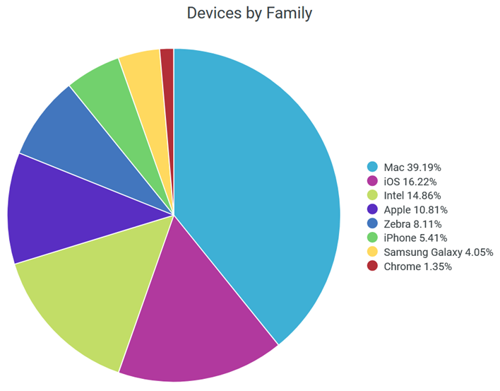
The tile shows the client devices in the network classified by the operating systems.
Place the cursor on a wedge, which represents an operating system, of the pie the chart to view additional information about the devices that use that operating system.
You can also see in the legend next to the chart the percentage of devices using each operating system. To hide information about an OS from the chart and see information only for the remaining operating systems, click the operating system name in the legend.
Top APs
Figure 12 shows the AP by Client Ordered chart.
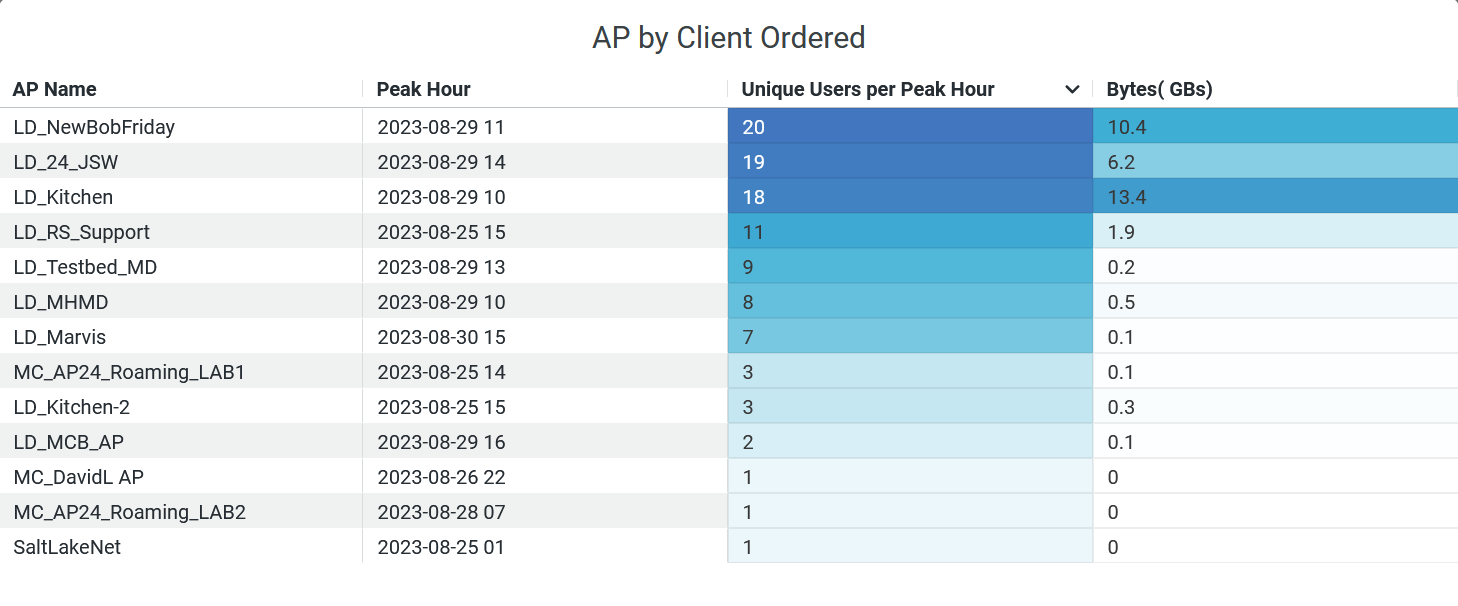
The tile shows the number of client devices connected to each AP. The tile displays:
- AP Name—Name of the AP.
- Peak Hour—Time stamp when an access point handles its peak traffic volume.
- Unique Users per Peak Hour—Number of client devices connected during a peak AP hour.
- Bytes (Gbps)—Volume of traffic during a peak AP hour.
Client Distribution by Protocol
Figure 13 shows the Client Distribution by Protocol tile.
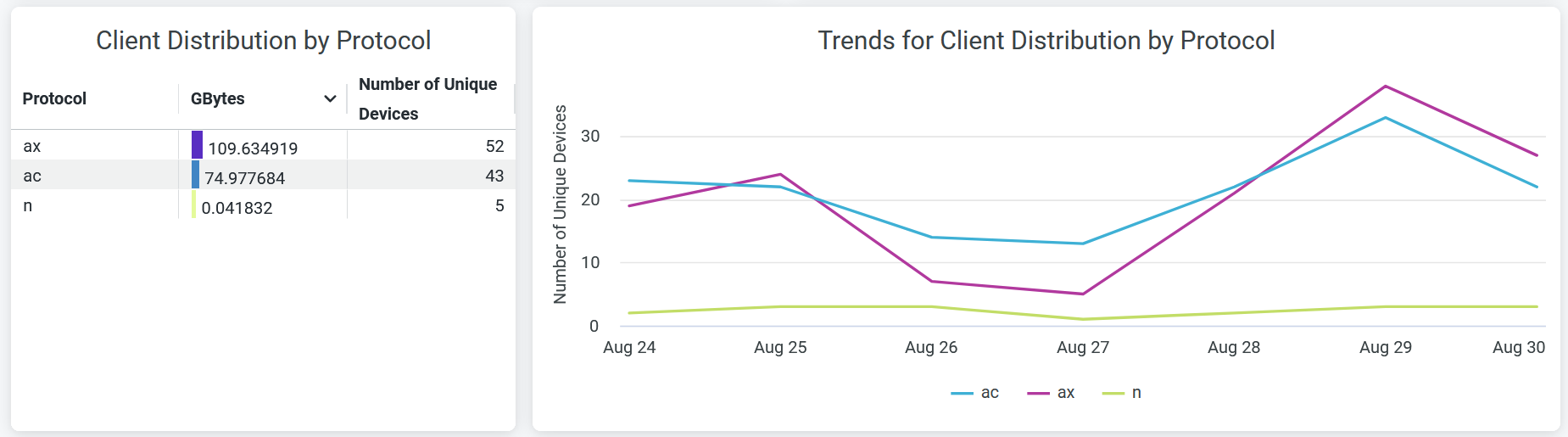
The tile displays information about client session distribution by the 802.11 protocols.
The Client Distribution by Protocol section of the tile shows the distribution of client devices and data usage by the 802.11 protocols.
The details include:
-
Protocol Name—Names of the 802.11 protocols.
-
GBytes—Traffic volume coming from the connected devices classified by the 802.11 protocols.
-
Unique clients—Number of unique devices operating on separate 802.11 standards.
The Trends for Client Distribution by Protocol section shows client connection trends classified by the 802.11 protocols.
Place your cursor on a point in a line graph to see the exact number of unique client devices in the selected protocol. To hide information about a protocol from the chart and see information only about the remaining protocols, click the protocol name in the legend.
Client Distribution by Bands
Figure 14 shows the Client Distribution by Bands tile.
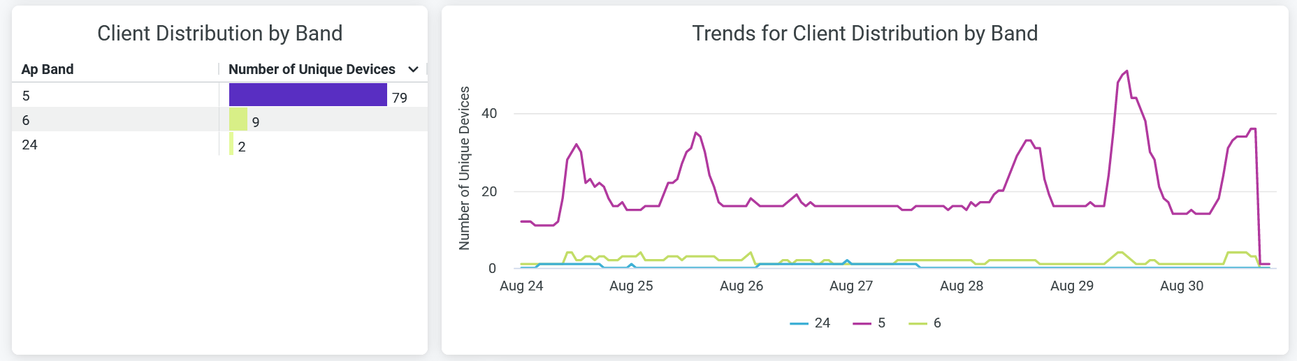
The Client Distribution by Band tile displays the following information that shows the distribution of client sessions by radio bands:
- AP Band—Radio band type- 2.4 GHz, 5 GHz, 6 GHz
- Number of Unique Devices—Number of unique devices operating in a specific radio band.
The Trends for Client Distribution by Band tile shows client connection trends classified by radio bands.
Place your cursor on a line graph, which represents a radio band, to see the exact number of unique client devices on that band. To hide data about a band from the chart and see data only about the remaining bands, click the band name in the legend.
Top 25 Sites by Connected Devices
Figure 15 shows the Top 25 Sites by Connected Devices tile.
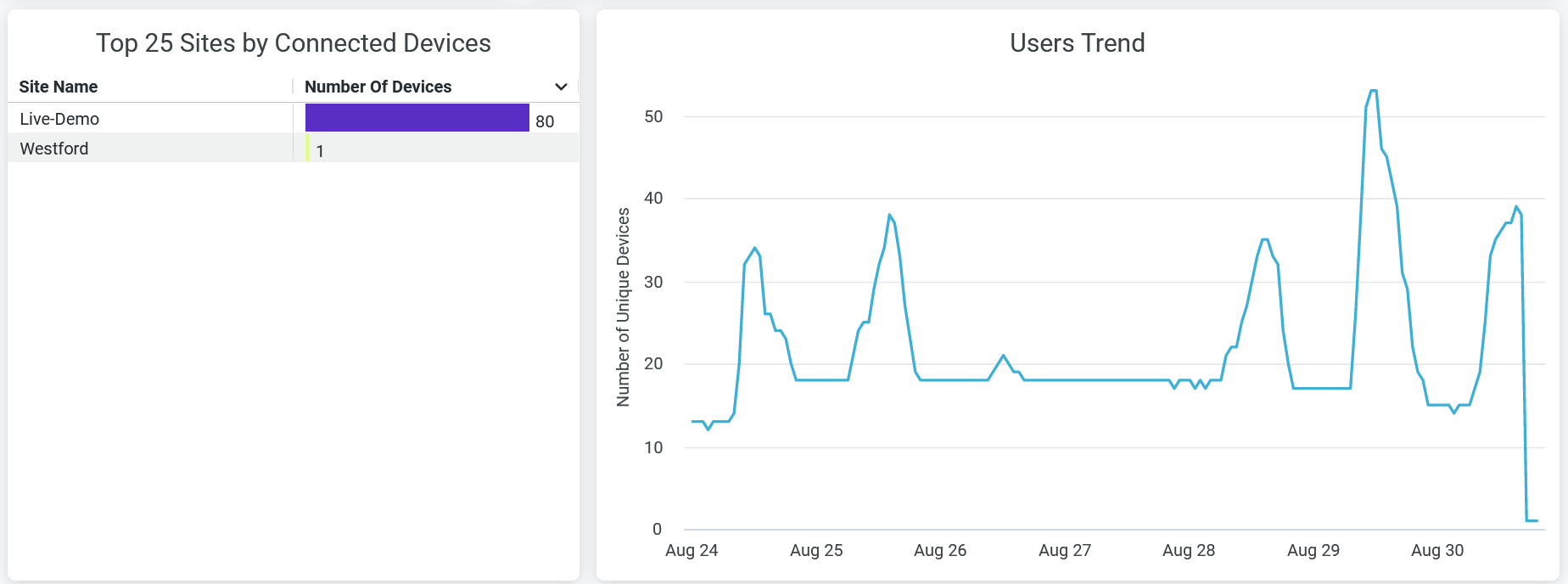
The Top 25 Sites by Connected Devices tile displays the top 25 sites sorted by the number of client connections. You can see the name of each site and the number of unique client devices connected to each site.
The User Trend tile displays client connection trends over 7 days.
Place your cursor on the chart to get the exact number of unique client device connections at a specific time.