


- play_arrow Overview
- play_arrow Premium Analytics - FAQs
- play_arrow Premium Analytics - Wireless Dashboard
- play_arrow Premium Analytics - Wired Dashboard
- play_arrow Premium Analytics - Location Dashboard
- play_arrow Premium Analytics - WAN Dashboard
- play_arrow Premium Analytics - Others (Access Assurance, Audit Logs and Inventory)
- play_arrow Occupancy Analytics
- play_arrow Network Analytics
- play_arrow Events
Engagement Analytics
Use Engagement Analytics to see the visitor count, trends, and dwell time. You can customize the dashboard to generate and download reports.
Features
Juniper Mist™ provides two types of Engagement Analytics—as part of Juniper Mist standard analytics and Juniper Mist™ Premium Analytics.
Table 1 presents a comparison of the features in the standard and premium versions of Engagement Analytics.
| Features | Standard Engagement Analytics | Premium Analytics |
|---|---|---|
Visitor segmentation and dwell time reporting based on user-defined dwell time. | Yes | Yes |
Unique visitor trends based on predefined labels for visitor segmentation | Yes | Yes |
Dwell time and visits per site, floor, AP, and zones | Yes | Yes |
Heatmap of floor and zone occupancies | Yes | Yes |
Popular motion paths including traffic flows between zones | No | Yes |
Data ingestion and reporting of location-based occupancy and third-party data | No | Yes |
Before You Begin
See Set the Engagement Dwell Limits and Schedule for a Site to enable the Engagement Analytics options for a site.
See Juniper Mist Location Services Guide to learn how to setup your sites and floor plans for location services.
See Mist Premium Analytics Trial License to know about the license requirements for Juniper Mist Premium Analytics.
- Become familiar with the options available on the Juniper Mist Premium Analytics dashboards. See Figure 3.
View Engagement Analytics Dashboard
To access the Network Analytics dashboard:
- From the left menu of the Juniper Mist portal, select Analytics
> Engagement Analytics. Figure 1: Analytics Dashboards
 The Engagement Analytics dashboard appears. This dashboard displays the default views of organization insights, which are grouped in different tiles, in the form of templates.
 - Use the options at the top of the dashboard to customize your view or build
new reports. Figure 2: Engagement Analytics Filter Options

Select an option from the org menu to define the scope of the report as entire organization, site, floorplan, access point, client, or zone.
Set the time period for the report. You can select an hour, day, week, month, or custom time range.
Click the print icon to print the report, and click the download icon to download the report.
Click the spanner icon to apply the defined scope and time period to all the tiles. This step ensures that you see reports for the same scope and time period on all the tiles.
Create Reports Using Templates
The Engagement Analytics dashboard displays default reports that you can use as templates to generate new, customized reports.
You can use any of the following templates to generate reports:
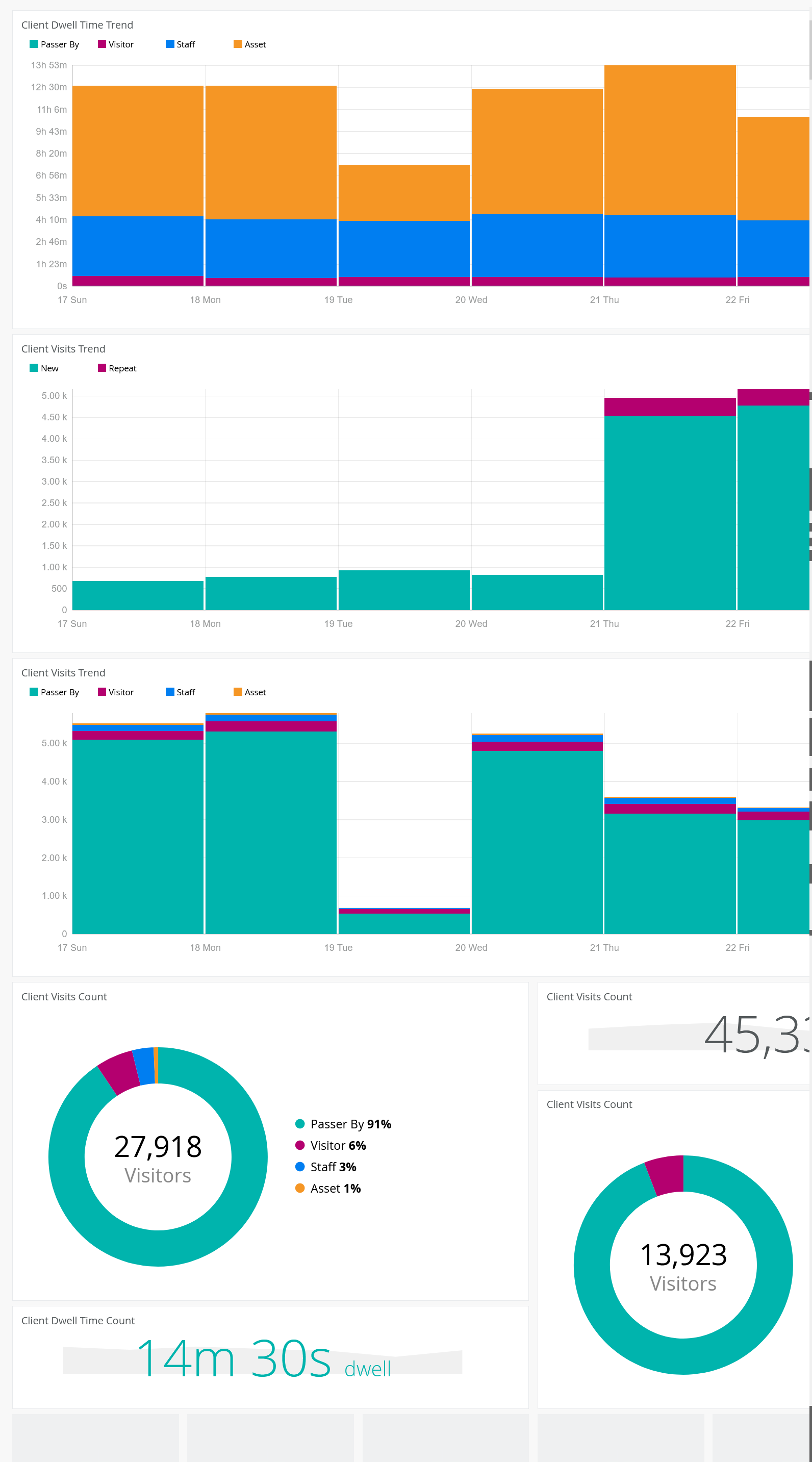
- Client Dwell Time Trend—Stacked bar graph that shows the dwell time by all the clients over 7 days. Each bar shows the total dwell time by four types of users—passerby, visitor, staff, and asset—in a day.
- Client Visits Trend (New and Repeat)—Stacked bar graph that shows the visitor count for 7 days. Each bar shows the total visits by two types of users—new and repeat—in a day.
- Client Visits Trend (User Type)—Stacked bar graph that shows the visitor count for 7 days. Each bar shows the total visits by four categories of users—passerby, visitor, staff, and asset—in a day.
- Client Visit Counts (New and Repeat)—Pie chart that shows the distribution of visitors in percentages for the selected duration. Each wedge in the chart represents a new or repeat user. Hover over any wedge to see the actual number of visitors.
- Client Visit Counts (User Type)—Pie chart that shows the distribution of visitors in percentages for the selected duration. Each wedge in the chart represents a user category—passerby, visitor, staff, and asset. Hover over a category to see the actual number of visitors.
- Client Visit Counts—Total number of visits.
- Client Visit Dwell Time Count—Average connection time by all the visitors.
To generate a new report by using the template:
- Click the required template to open the template on a new page. The following figure shows the Client Visits Count template on a new page.Figure 4: Generate Report Using Template

Use the following options to customize your report:
- Click the title of the tile to rename the report.
- Select the metrics that you want to include in the report:
- Applications—Visitor traffic and data usage for the particular application.
- Assets—Total count of all assets. You can select sub categories—dwell time, visits, and wait time.
- App Clients—Number of visitors connected through applications. You can select sub categories—dwell time, visits, and wait time.
- BLE Clients—Number of visitors connected through a BLE.
- Wireless Clients—Number of visitors connected through a wireless device. You can select sub categories—dwell time, visits, and wait time.
- WLANs—Number of WLANs that support connections.
- Select the option to sort the report. The availability of sorting options depends on the metrics that you select to customize the report.
- You can sort the report by:
- Bytes and clients (Applications)
- Count, trend, locations (Assets, App clients, BLE clients)
- Count, trend, list, ranked, locations (Wireless clients)
- Count, list, ranked (WLANs)
- Select any of the following options as the scope of the report:
- Entire Organization
- Sites
- Floor Plan
- Access Point
- Zone
- Select the duration. You can select by day, week, month, custom date, custom date and time range.
- Select color from the available options for the report.
- Use filters to further refine your report. You can apply filters for
the WLAN criteria. Available options are:
- Radio bands
- Device model
- Device type
- Operating system
- WLAN

