About the Network Health Page
Paragon Automation offers a way to visualize device-level and network-level health problems through the Network Health page. You can visualize network health data in a time line — of devices, device groups, and network groups — or at a more granular levels of keys so that you can discover the root cause of issues detected by the platform.
Use the Health page (Monitoring > Network Health) to monitor and track the health of a single device, a device group, or a network group. You can also troubleshoot problems. Select an entity type (DEVICE, DEVICE GROUP, or NETWORK) located in the top left corner of the page. Once you select an entity type, you can then select a device name, device group name, or a network group name from the drop-down menu. From the date and time displayed below the Entity Type, you can select any date and time (in AM/PM format) for which you want to view the network health data.
You can click Save as Default after selecting a device or device group to save that setting as the default view on the Network Health page. Click Clear Default to clear the saved settings.
The page is divided into the following three main views that, when used together, can help you investigate the root cause of problems detected on your devices:
You can navigate to the Time Inspector View from the Table View, if you chose device group as the entity type and selected multiple devices.
Timeline View
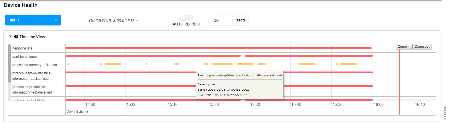
In timeline view, you can monitor real-time and past occurrences of KPI events flagged with a minor or major severity level health status. The general characteristics and behaviors of the time line include (see Figure 1):
-
Clicking on the right caret next to the Timeline View heading expands or collapses the time line.
-
Each dot or line in the time line represents the health status of a unique KPI event (also known as a Paragon Insights rule trigger) for a pre-defined KPI key with which Paragon Insights has detected a minor or major severity level issue. The name of each event is displayed (per device) directly to the left of its associated health status dot or line.
-
The health status dot or line for each unique KPI event in the time line can consist of several different KPI keys. Use tile view and table view to see the health status information for the KPI keys.
-
Only minor or major severity level KPI events are displayed in the time line. Yellow represents a minor event and red represents a major one.
-
A KPI event that occurs once (at only one point in time) and does not recur continuously over time is represented as a dot.
-
A KPI event that occurs continuously over time is represented as a horizontal line.
-
Time line data is by default displayed for a two-hour customizable time range. However, you can enlarge the time line graph (shorten the time range covered) by clicking on the Zoom in button and shrink the time line graph (extend the time interval covered) using the Zoom out button at the top right corner of the graph.
-
The red vertical line on the time line represents the current time.
-
The blue vertical line on the time line represents the user-defined point of time for which to display data. If you double click on any other time point in the time line graph, the blue line shifts to the location where you clicked and the graph displays two hours before and after the current position of the blue vertical line.
The Tile View and the Table View are updated to populate data on trigger evaluations and key performance indicators for the current time represented by the blue line.
The following table describes the main features of the time line:
|
Feature |
Description |
|---|---|
|
Display information about a dot or horizontal line in the time line. |
Hover over the dot or horizontal line to display the associated KPI event name, device name, health status severity level, and event start and end times. Additional health status information about the KPI event can be found in tile view. For information about tile view, see the Tile View section. |
|
For the displayed data, change the range of time (x-axis) that is visible on the page. |
Options:
|
|
Choose a different two-hour time range of data to display. |
Use the blue vertical line to customize the time range of data to display. Options for enabling the blue vertical line:
Data is generally displayed for 1 hour before and 1 hour after the blue line. Hover over the blue line to display the exact point in time that it represents. Drag the blue line left or right to adjust the time. Note:
Auto-refresh is disabled whenever you enable the blue line. Re-enabling auto-refresh disables the blue line and resets the time line to display the most recent two-hour time range of data. |
|
Freeze the time line (disable auto-refresh). |
Toggle the auto-refresh switch to the left. |
|
Unfreeze the time line (enable auto-refresh). |
Toggle the auto-refresh switch to the right. |
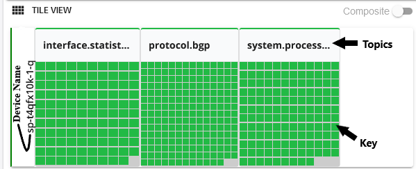
Tile View
The tile view uses colored tiles to allow you to monitor and troubleshoot the health of a device. The tiles are organized first by topic and by unique KPI key (see Figure 3) for the device or for the devices you selected in a device group or network group. By default, the tile view data corresponds to the most recent data collected. To customize the point in time for which data is displayed in tile view, select a particular point in time from the date/time drop-down menu (located above the time line) or enable the blue vertical line in timeline view. For information about how to enable the blue vertical line, see the Timeline View section.
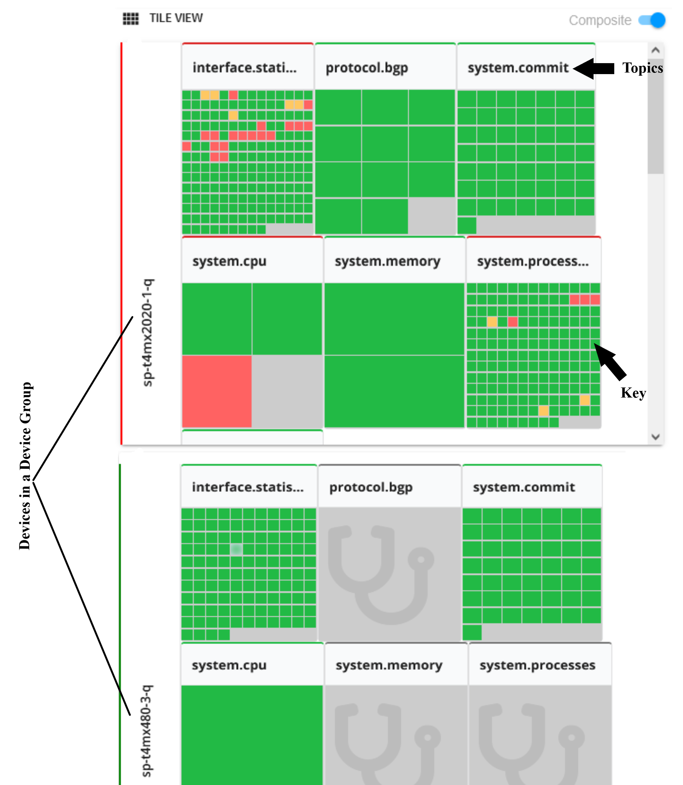
The following table describes the meaning of the severity level colors displayed by the status tiles:
|
Color |
Definition |
|---|---|
|
Green |
The overall health of the KPI key is normal. No problems have been detected. |
|
Yellow |
There might be a problem with the health of a KPI key. A minor problem has been detected. Further investigation is required. |
|
Red |
The health of a KPI key is severe. A major problem has been detected. |
|
Gray |
No data is available. |
The following table describes the main features of the tile view:
|
Feature |
Description |
|---|---|
|
Display information about a status tile. |
Options:
Note: If the number of KPI keys exceeds 220, the keys are automatically aggregated and grouped. |
|
Display information in table view about the status tiles associated with a single topic. |
Click on a topic name in tile view. For information about table view, see the Table View section. |
|
Composite Toggle |
When active, users can click on specific keys within the tile groups. This allows you to pass multiple KPIs to the Time Inspector View. |
Table View
The table view allows you to monitor and troubleshoot the health of a single device provided in a customizable table. You can search, sort, and filter the table data to find specific KPI information, which can be especially useful for large network deployments. To select which attributes are displayed in the table, check the appropriate check box in the field selection bar above the table (see Figure 4). The checkbox on the left side of each row is used to help activate the Time Inspector view. Multiple rows can be selected at one time.
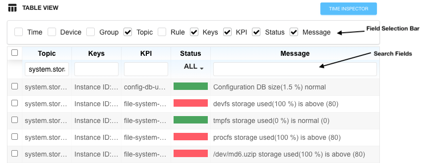
The following table describes the attributes supported in table view:
|
Attributes |
Description |
|---|---|
|
Time |
Time and date the event occurred. |
|
Device |
Device name. |
|
Group |
Device group name. |
|
Topic |
Rule topic name. |
|
Keys |
Unique KPI key name. |
|
KPI |
Key Performance Indicator (KPI) name associated with an event. |
|
Status |
Health status color. Each color represents a different severity level. |
|
Message |
Health status message. |
The following table describes the meaning of the severity level colors displayed by the Status column:
|
Color |
Definition |
|---|---|
|
Green |
The overall health of the KPI key is normal. No problems have been detected. |
|
Yellow |
There might be a problem with the health of a KPI key. A minor problem has been detected. Further investigation is required. |
|
Red |
The health of a KPI key is severe. A major problem has been detected. |
The following table describes the main features of the table view:
|
Feature |
Description |
|---|---|
|
Sort the data by ascending or descending order based on a specific data type. |
Click on the name of the data type at the top of the column by which you want to sort. |
|
Filter the data in the table based on a keyword. |
Enter the keyword in the text box under the name of a data type at the top of the table (see Figure 4). |
|
Navigate to a different page of the table. |
Options:
|
|
If the data in a cell is truncated, view all of the data in a cell. |
Options:
|
|
Row selection checkbox |
Make this row’s data available for Time Inspector view. |
Time Inspector View
Time Inspector is a composite view that provides a timeline view of trigger conditions on KPI data that you selected in Table View. You can also drag and drop trigger conditions to view the conditions in one graph or as separate graphs. Time Inspector was initially available only when the entity type DEVICE GROUP is selected. However, Time Inspector View is available when you select Device or Network entity type as well. After you select an entity type, you can access time inspector view by clicking the TIME INSPECTOR button located below the Timeline View pull-down.
This view allows you to drill down into field-level data for specific triggers over a time line.
When the Health page is first accessed, the TIME INSPECTOR button is disabled. For more information on activating the TIME INSPECTOR button, see Activate Time Inspector View .
The Composite toggle switch at the upper right of the TILE VIEW is used along with Time Inspector View. The Composite toggle switch allows you to select data from more than one topic to be shown in the Table View and, thus, the Time Inspector View. This can be useful when topics must be combined to find root cause for an issue. For example, system memory usage could combine with output queue usage to create a performance issue in an overloaded system. In certain cases, such as for keys that represent interface statistics on bandwidth utilization, a single tile could represent more than one key.
Figure 5 below shows a time inspector window created from the system.storage usage topic for a specific device.
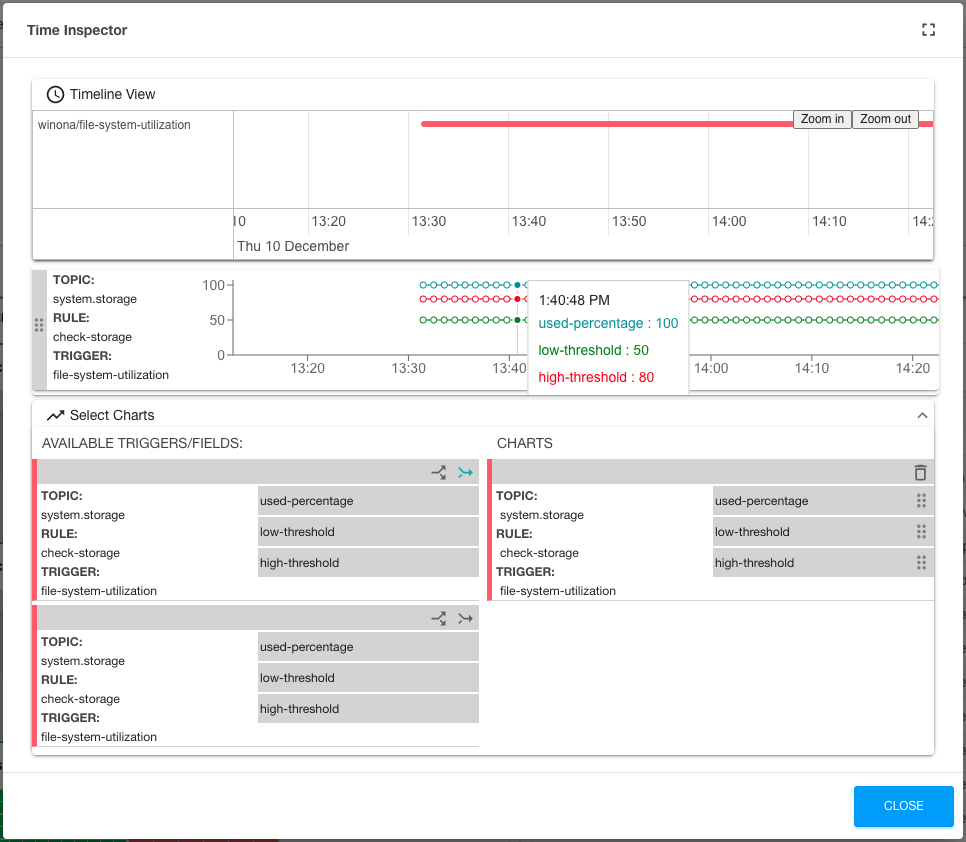
As you can see, the Time Inspector window has a mini time line at the top, a topic-based line chart below, and a chart selector section at the bottom. This particular chart was created as a composite (indicated by the merging blue arrow) of a file-system-utilization in the check-storage rule of the system.storage topic.
Note that there are 3 fields in the check-storage rule: used-percentage, low-threshold, and high-threshold. Since the chart was created as a composite (fields charted together) there are three lines on the displayed chart. If the “chart fields separately” button (diverging arrows) were clicked instead, you would see 3 single-line charts showing the same data.
The more rules you select with the TABLE VIEW check boxes, the more charts you can create in the Time Inspector view.