- play_arrow Introduction
- play_arrow Overview
- play_arrow Access the Paragon Automation GUI
- play_arrow Access the Paragon Planner
- play_arrow Configure SMTP, LDAP, and Portal Settings
- play_arrow Manage Users
- play_arrow Manage Roles
- play_arrow Manage User Groups
- play_arrow Identity Providers
-
- play_arrow Workflows
- play_arrow Base Platform
- play_arrow Paragon Pathfinder
- play_arrow Paragon Planner
- play_arrow Paragon Insights
-
- play_arrow Manage Devices and Network
- play_arrow Devices
- play_arrow Device Groups
- play_arrow Device Images
- play_arrow Network
- play_arrow Network Groups
- play_arrow Topology Filter
-
- play_arrow Manage Device Templates and Configuration Templates
- play_arrow Configuration Templates
- Configuration Templates Overview
- Configuration Templates Workflow
- About the Configuration Templates Page
- Add Configuration Templates
- Preview and Render a Configuration Template
- Assign Configuration Templates to a Device Template
- Deploy a Configuration Template to a Device
- Edit, Clone, and Delete a Configuration Template
- play_arrow Device Templates
-
- play_arrow Manage Sensor Settings, Insights Settings, and Data Summarization Profiles
- play_arrow Sensor Settings
- Sensors Overview
- About the Ingest Settings Page
- Configure NetFlow Settings
- Configure a Rule Using Flow Sensor
- About the Frequency Profiles
- Manage Frequency Profiles
- Apply a Frequency Profile
- Configure Offset Time
- Configure a Rule Using Server Monitoring Sensor
- Configure Native GPB Ingest
- Configure sFlow Settings
- Configure SNMP Ingest
- Configure a Rule Using SNMP Scalar
- Configure SNMP Trap and Inform Notifications
- Configure Outbound SSH Port for iAgent
- Configure System Log Ingest
- System Log Optional Configurations
- Configure a Rule Using Syslog
- Understand Inband Flow Analyzer 2.0
- Configure Device Details for Inband Flow Analyzer Devices
- Delete an Inband Flow Analyzer Device
- Understand Bring Your Own Ingest
- Load BYOI Default Plug-ins
- Configure Bring Your Own Ingest Default Plug-in Instances
- Build and Load BYOI Custom Plug-in Images
- Configure Bring Your Own Ingest Custom Plug-in Instances
- Use Sample Rule and Playbook Configurations for BYOI Custom Plug-in Instances
- Configure Ingest Mapping for Default BYOI Plug-in Instances
- Delete a BYOI Plug-in
- About the Diagnostics Page
- Use the Self Test Tool
- Use the Reachability Test
- Use the Ingest Test Tool
- Use the No-Data Tool
- Paragon Insights Tagging Overview
- Types of Tagging
- Add a Tagging Profile
- Apply a Tagging Profile
- Delete a Tagging Profile
- Understand User-Defined Actions and Functions
- Modify User-Defined Action, Function, and Workflow Engines
- Enable UDA Scheduler in Trigger Action
- Understand kube-state-metrics Service
- play_arrow Insights Settings
- About the Insights Settings Page
- Add Alert Blackouts
- About Alert Notifications
- Use Exim4 for E-mails
- Configure the Exim4 Agent to Send E-mail
- Configure a Notification Profile
- Enable Alert Notifications for Device Groups and Network Groups
- Configure Report Settings
- Configure Scheduler Settings
- Configure a Retention Policy
- Configure Destination Settings
- Time Series Database (TSDB) Overview
- Manage Time Series Database Settings
- Backup and Restore the TSDB
- Time Series Database Replication Scenarios
- play_arrow Data Summarization Profiles
-
- play_arrow Configure Your Network
- play_arrow Topology
- play_arrow Network Information Table
- Network Information Table Overview
- About the Node Tab
- Add a Node
- Edit Node Parameters
- Delete a Node
- About the Link Tab
- Add a Link
- Edit Link Parameters
- Delete a Link
- About the Tunnel Tab
- Understand How Pathfinder Handles LSPs
- Reroute LSPs Overview
- Segment Routing Overview
- Add a Single Tunnel
- Add Diverse Tunnels
- Add Multiple Tunnels
- Edit and Delete Tunnels
- About the Demand Tab
- About the Interface Tab
- Container LSP Overview
- About the Container LSP Tab
- Add a Container LSP
- Edit Container LSP Parameters
- Maintenance Event Overview
- About the Maintenance Tab
- Add a Maintenance Event
- Edit a Maintenance Event
- Simulate a Maintenance Event
- Delete a Maintenance Event
- About the P2MP Groups Tab
- Add a P2MP Group
- Edit P2MP Group Parameters
- About the SRLG/Facility Tab
- Add an SRLG/Facility
- Edit SRLG/Facility Parameters
- About the Topology Group Tab
- Add Anycast Group Tunnels
- play_arrow Tunnels
- play_arrow Change Control Management
-
- play_arrow Monitoring
- play_arrow Monitor Network Health
- play_arrow Manage Alarms and Alerts
- play_arrow Monitor Jobs
- play_arrow Analytics
- play_arrow Monitor Workflows
-
- play_arrow Reports
- play_arrow Health Reports
- play_arrow Network Reports
- play_arrow Maintenance Reports
- play_arrow Inventory Reports
- play_arrow Demand Reports
-
- play_arrow Administration
- play_arrow Manage E-mail Templates
- play_arrow Manage Audit Logs
- play_arrow Configure External EMS
- play_arrow Manage Task Scheduler
- play_arrow Manage Security Settings
- play_arrow License Management
-
ON THIS PAGE
Charts Overview
Paragon Automation Platform offers three types of charts that include time series graphs, histograms, and heatmaps. You can use charts to monitor the status and health of your network devices. Charts allow you to visualize data collected by Paragon Insights from a device. To create charts, navigate to the Monitoring > Graphs > Charts page.
Types of Charts
You can create the following graphs from the Charts page.
Time Series Graphs
Time series graphs are charts that show data in a ’2D’ format where the x-axis indicates time and the y-axis indicates value. Time series graphs are useful for real-time monitoring, and also to show historical patterns or trends. This graph type does not provide insight into whether a value is ’good’ or ’bad’, but only shows ’the latest value’.
Histograms
Histograms are graphs that work quite differently than time series graphs. Rather than show a continuous stream of data based on when each value occurred, histograms aggregate data to show the distribution of values over time. This results in a graph that shows ’how many instances of each value’. Histograms also show data in a ’2D’ format, however, the x-axis indicates the value while the y-axis indicates the number of instances of the given value.
Heatmaps
Heatmaps are a combination of time series graphs and histogram elements. Heatmaps provide a ’3D’ view to help determine the deviations in data. Like a time series graph, the x-axis indicates time, and the y-axis indicates value. Heatmaps also include the number of instances of the given value similar to a histogram. Heatmaps also include a color dimension in the chart to add content. For each column in a heatmap, the bars indicate the various values that occurred. The color indicates how often the values occurred relative to the neighboring values. Within each vertical set of bars, the values that occurred more frequently show as ’hotter’ with orange and red, while those values that occurred less frequently show as shades of green.
Example Illustrations
To help illustrate the three types of charts, consider the graphs shown below.
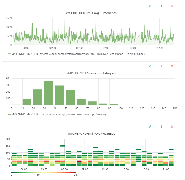
All three graphs show the same data—the running 1-minute average of CPU utilization on a device over the last 24 hours. However, the way the data is depicted in each illustration is different.
The time series graph provides the typical view; every minute it adds the latest data point to the end of the line graph. Time moves forward along the x-axis from left to right, and the data values are indicated on the y-axis. However, this graph doesn’t show how often each data point has occurred.
The histogram groups together the values to show how many of each data point there are. The tallest bar is the one between 30 and 40, which means that the most common 1-minute CPU average value is in the 30-40% range. And based on the y-axis, there have been over 350 instances of values in this range. The next most frequently occurring values are in the 40-50% range (almost 300 occurrences), while the 0-10% range has almost no occurrences, suggesting that this CPU is rarely idle. This graph doesn’t show how many instances of each data point occurred within a given time range.
The heatmap makes use of elements from the time series graph and histogram. Each small bar indicates that some number of instances occurred within the value range shown in the y-axis, at the given time show in the x-axis. The color indicates which value ranges, for each given time, occurred more than others. The vertical set of bars towards the right of the graph, at 18:00 illustrates this. In this example (at this zoom level), each column of vertical bars represents 12 minutes, and each small bar represents a bucket of 15 values. So the first (lowest) bar indicates that within this time range there were some values in the 0-14 range. The bar above indicates that within this time range there were some values in the 15-29 range, and so on. The color indicates which bars have more values than others. In this example, the third bar is red indicating that for those 12 minutes most of the values fell into the 30-44 range (in this example the count is 21). By contrast, the first bar is the most green indicating that for those 12 minutes the least number of values fell into the 0-14 range (in this example the count is 1). This ’heat’ information is also supported by the histogram; the most frequently occurring values were those in the 30-40 range, which is the ’hotter’ range in the heatmap.