GUI Overview
The Paragon Automation GUI provides an easy to use, single pane of glass experience that allows you to access the different use cases and features.
To access the Paragon Automation GUI, you must log in using your Paragon Automation account. For more information, see Access the Paragon Automation GUI. After you log in successfully to the Paragon Automation GUI, you are taken to the Troubleshoot Devices page, which displays the devices belonging to your organization and enables you to manage the devices. For more information, see About the Troubleshoot Devices Page.
In this topic, we’ll discuss some commonly used elements and features of the Paragon Automation GUI.
Menu and Banner
The two elements of the Paragon Automation GUI that you’ll use frequently are as follows:
-
Menu: The menu, which is available at the left-side of the GUI, is minimized by default. You can hover over or click inside the menu to expand the menu. A sample of the expanded menu is shown in Figure 1.
You can expand the menu and click different menu entries to navigate to the different pages in the Paragon Automation. For details about the menu, see GUI Menu Overview.
-
Banner: The banner, which is displayed at the top of the page (see Figure 1) contains several icons and GUI elements that you’re likely to use regularly. These icons and GUI elements are explained in Table 1.
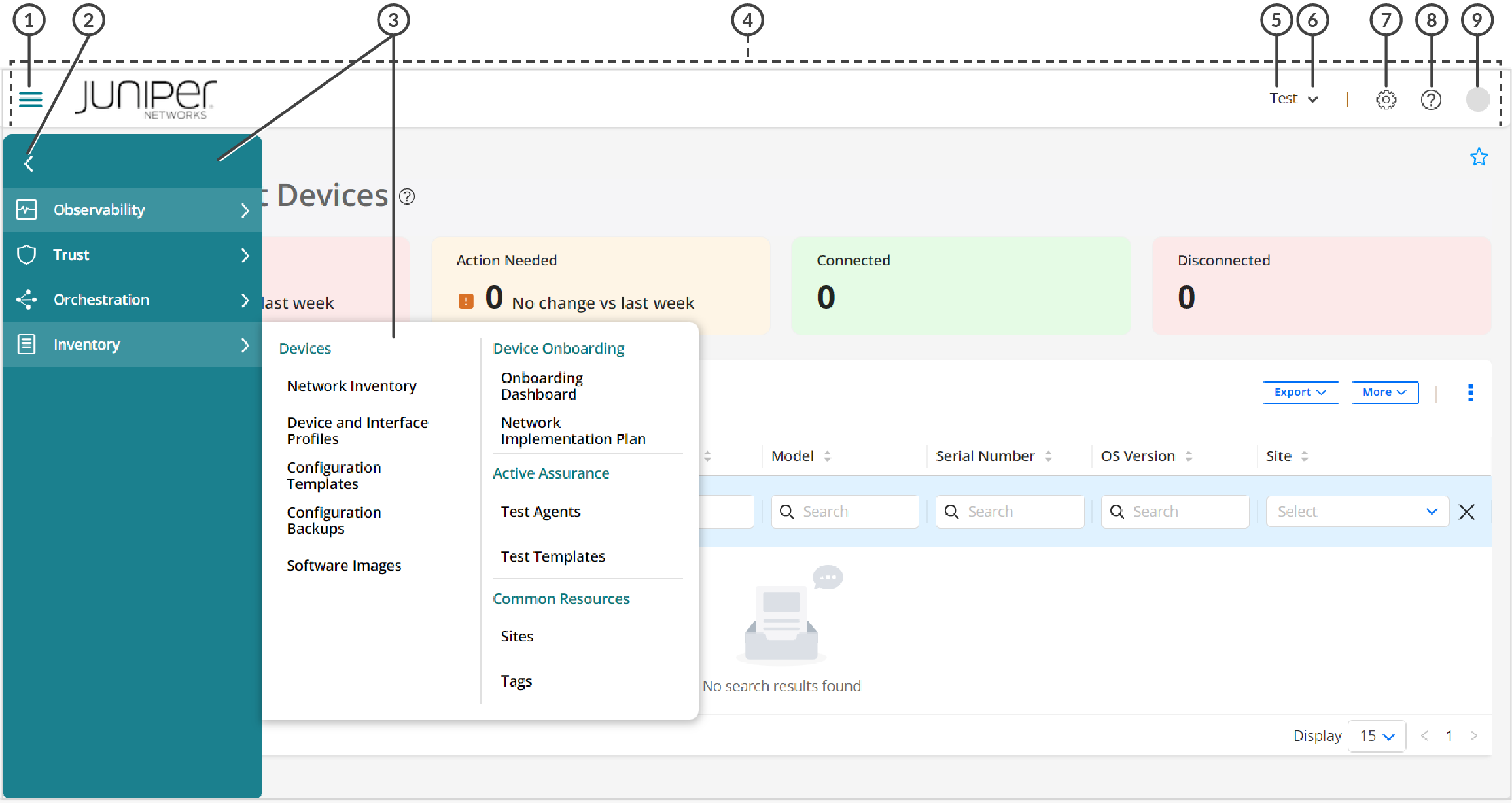
1 — Menu toggle icon | 6 — Organization drop-down |
2 — Expand/Collapse Navigation | 7 — Settings Menu |
3 — Menu bar and expanded menu | 8 — Help (?) icon |
4 — Banner | 9 — User account icon |
5 — Organization name |
| Description | Function |
|---|---|
| Menu Toggle | Click either the menu toggle icon (the icon with three horizontal bars) in the top left of the banner or the Expand/Collapse Navigation button (> or <) to toggle the visibility of the Paragon Automation menu. If the menu was previously hidden, it is displayed, and the menu is hidden if it was previously displayed. |
| Organization drop-down | The Organization drop-down displays the current organization that you are
accessing. Click the Down arrow next to the organization name expand the drop-down.
You can:
|
|
Settings Menu |
Click the gear icon to quickly access the following settings from the banner instead:
|
| Help (?) menu | Click the (?) (help) icon to
access the help menu, which provides links to the following:
|
| User account icon | Click the user account icon to access the user account
menu, This menu displays your name and e-mail address, and you can do the
following:
|
Breadcrumbs and GUI Elements in Landing Pages
Figure 2 shows the breadcrumbs, page help, and other GUI elements or icons, and Table 2 provides a high-level explanation of their functions.
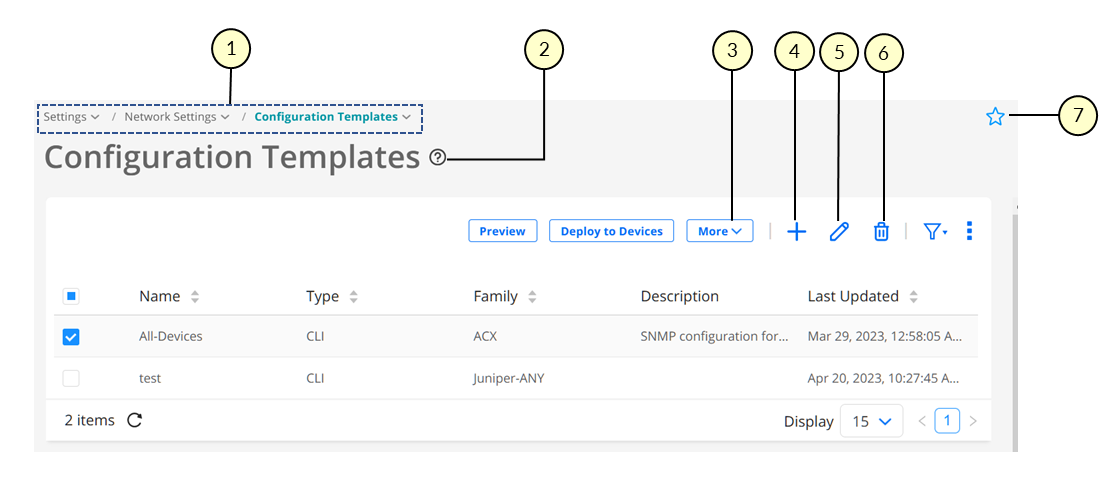
1 — Breadcrumbs | 5 — Edit icon |
2 — Page Help icon | 6 — Delete icon |
3 — More drop-down | 7 — Favorite icon |
4 — Add or Create icon |
| Description | Function |
|---|---|
| Breadcrumbs | The breadcrumbs in the Paragon Automation display the menu structure and
provide an alternative way to navigate the menu. Click the Down arrow next to a breadcrumb to access the menu entries at that menu level. |
| Page Help icon | Click or hover over the page help (?) icon to view help text for the page and
access the More... link. You can click the More... link to open the in-application help topic for that page. |
| More drop-down | The More drop-down provides additional options for tasks that you can perform on a page. |
| Add or Create (+) icon | Used to add or create an entity; for example, create a site. |
| Edit (pencil) icon | Used to modify an existing entity; for example, modify a site. |
| Delete (trash can) icon | Used to delete an entity; for example, delete a site. |
| Favorite icon | Used to mark a page as a favorite page or remove a page that was previously marked as a favorite. See View, Add, and Remove Favorite Pages. |
Sort, Resize, Filter, and Search Icons, and Related GUI Elements
Figure 3 shows the sort, filter, search, and related GUI elements that you typically encounter on landing pages (for example, Sites). Table 3 lists these icons and provides a high-level explanation of their functions.
The search and filter icons might not be available on some pages.
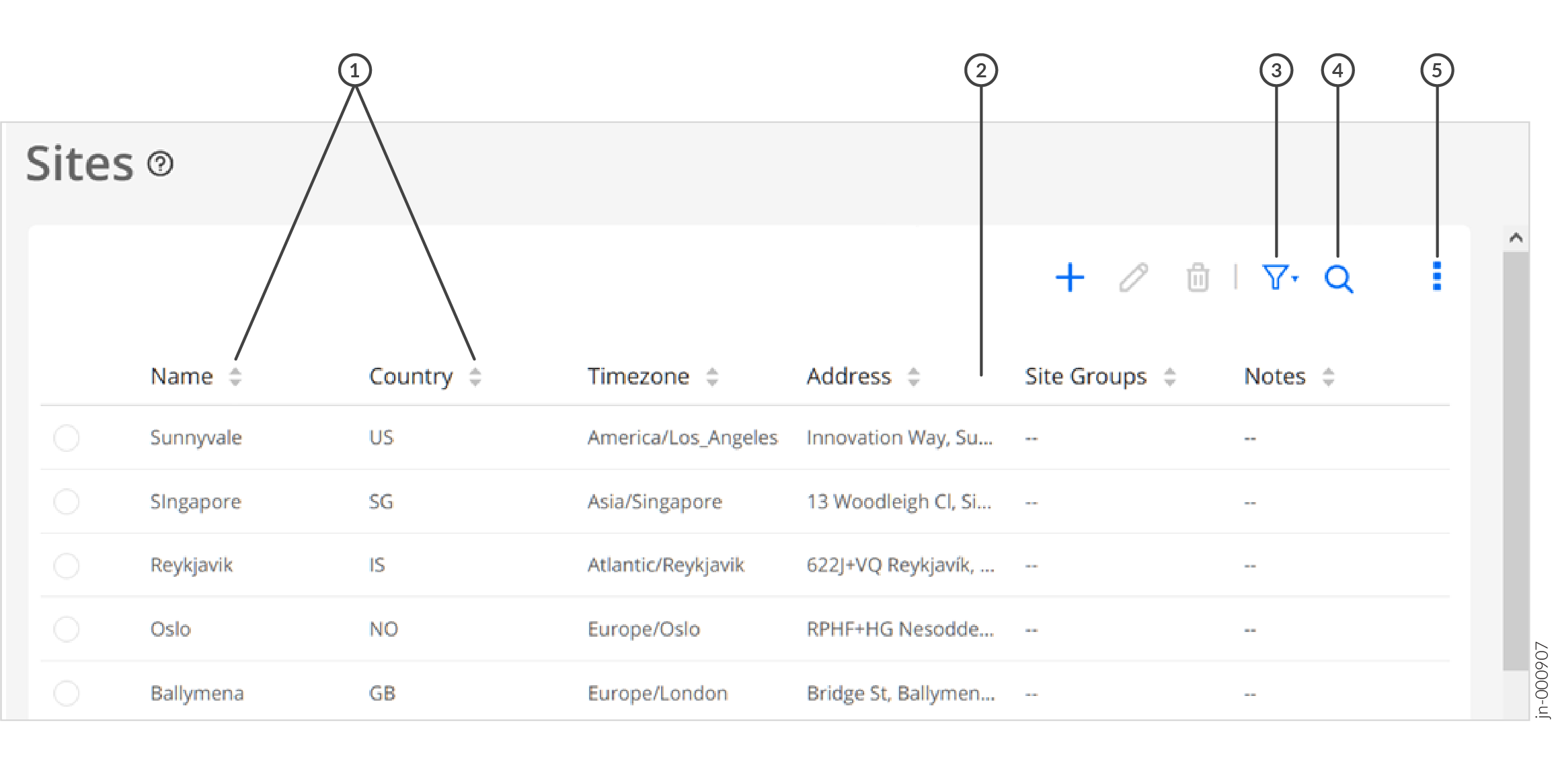
1 — Sort icons | 4 — Search icon |
2 — Resize column icon | 5 — Column and Page Preferences Menu |
3 — Filter icon |
| Description | Function |
|---|---|
| Sort icons | The sort icons next to a column label in a table (grid) indicate that the data
can be sorted (in ascending or descending order) based on that column. To sort the data, click the column label. The corresponding sort icon changes color to indicate whether the data is sorted in ascending or descending order. |
| Column Resize icon | In some tables, columns can be resized by moving your mouse between two column names until you see the column resize icon. You can then left-click your mouse, and hold and drag the mouse resize the column. |
| Re-arrange columns | To move a column, click inside a column label, hold and drag to move the column to where you want it to be placed, and release. |
| Filter icon (funnel) | You can apply one or more filters to the data in the table and, if needed, save
the filters. Hover over or click the filter icon to access the filtering menu. For more information, see Filter Data in a Table. |
| Search icon (magnifying glass) | You can click the search icon search the data and, if needed, save the search
as a filter.
|
| Vertical Ellipsis icon | Click or hover over the vertical ellipsis to access the column and page
preferences menu. You can do the following:
|
Page Display, Navigation, and Related GUI Elements
Figure 4 shows the GUI elements related to page display and navigation, which that you typically encounter on landing pages (for example, Sites). Table 4 lists these GUI elements and provides a high-level explanation of their functions.
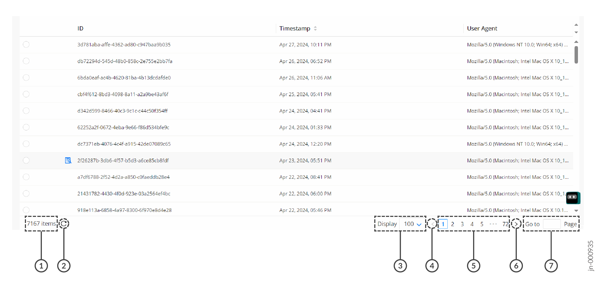
1 — Total number of entries (items) available | 5 — Page numbers |
2 — Refresh icon | 6 — Navigate to the next page icon |
3 — Number of items displayed per page | 7 — Go to (page number) |
4 — Navigate to the previous page icon |
| Function | Description |
|---|---|
| Total-number [of] items | Displays the total number of items or entries available on a page. |
| Refresh icon | Typically, pages in the Paragon Automation GUI refresh automatically. However, you can click the Refresh icon to trigger a manual refresh if needed. |
| Display options | This field displays the number of entries per page in the table (grid). You can click the number and select the number of items that you want to display. |
| Previous Page (<) icon | For tables displaying two or more pages, click < to go to the previous page. |
| Page numbers | Displays one or more page numbers depending on the number of pages of items (entries) displayed. Click the page number to go to that page. |
| Next Page (>) icon | For tables displaying two or more pages, click > to go to the next page. |
| Go to page-number | For tables displaying two or more pages, enter the page number in the text box and press Enter to go to that page. |
View, Add, and Remove Favorite Pages
In Paragon Automation, you can mark pages that you frequently use as favorites, so that you can access such pages easily. You can view existing favorites in the Favorites menu, remove existing favorites, or add pages as favorites. A sample page showing the Favorites menu, icons, and so on is shown in Figure 5.
The Favorites menu appears only if at least one page marked as a favorite.
You can do the following:
-
View or access favorite pages: You can use the Favorites menu to view and access existing favorite pages.
-
Add a page as a favorite: You can add a page as a favorite in one of the following ways:
-
By clicking the star icon next to the menu entry.
-
By clicking the star icon at the top right corner of a page (below the Paragon Automation banner).
When you add a page as a favorite, it appears under the Favorites menu. The star icon is shaded (filled), which indicates that the page is a favorite.
-
-
Remove a page as a favorite: You can remove a page as a favorite in one of the following ways:
-
By clicking the shaded star icon in the Favorites menu.
-
By clicking the shaded star icon next to the menu entry.
-
By clicking the shaded star icon at the top right corner of a page.
When you remove a page as a favorite, it no longer appears in the Favorites menu. The star icon changes to empty (unshaded), which indicates that the page is not a favorite.
-
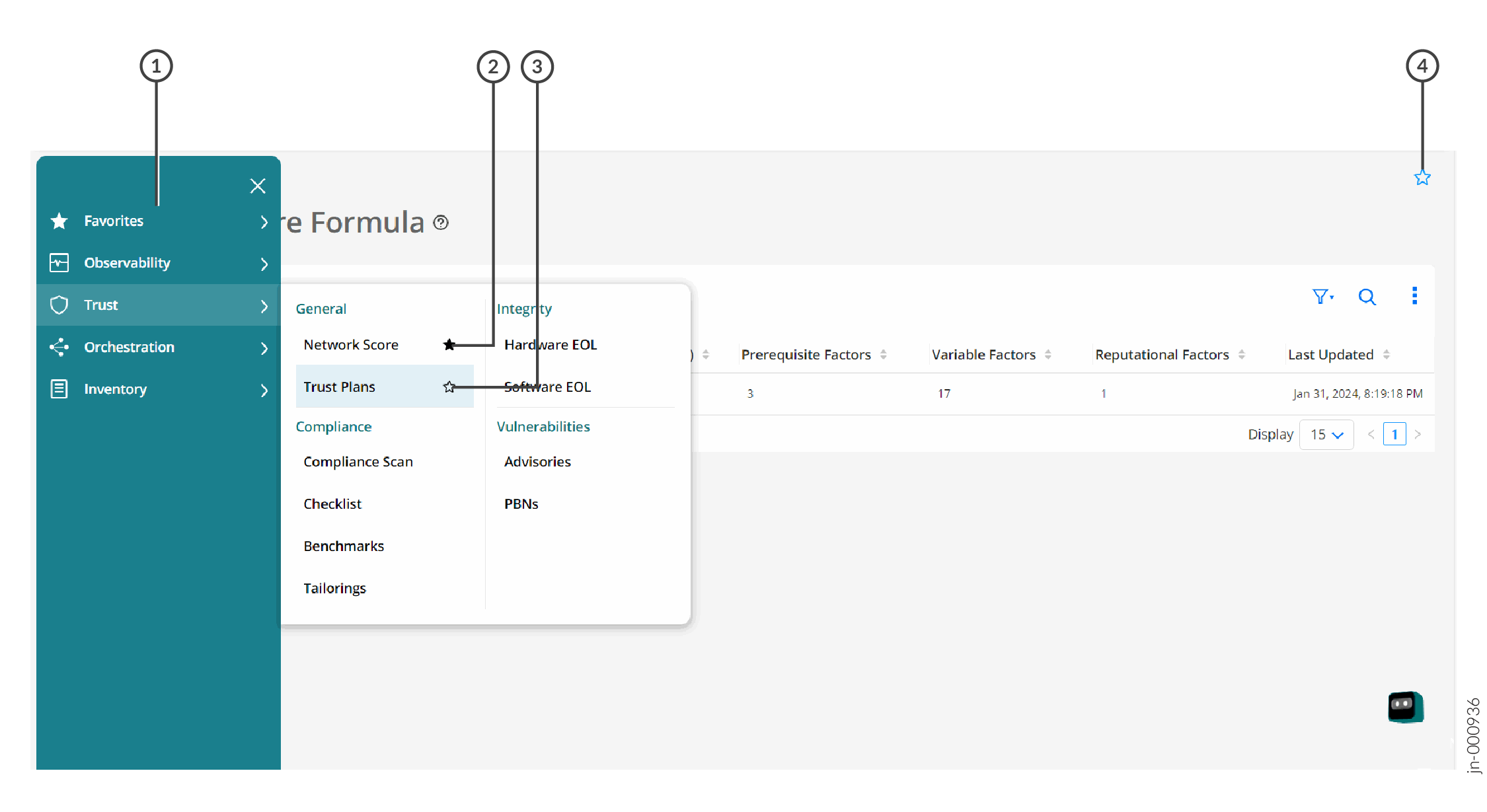
1 — Favorites menu | 3 — Add as a favorite (using the menu) |
2 — Remove existing favorite (using the menu) | 4 — Add as a favorite (using the page) |
Filter Data in a Table
Paragon Automation enables you to filter the data displayed in a table (grid) based on filter criteria. You can specify one or more criterion, and use conditional operators (AND or OR) to create a combination of filter criteria.
Figure 6 shows the expanded filter menu with and without filters and Figure 7 shows a sample page on which filter criteria are applied. Table 5 explains the different icons and GUI elements related to filters (as shown in Figure 7).
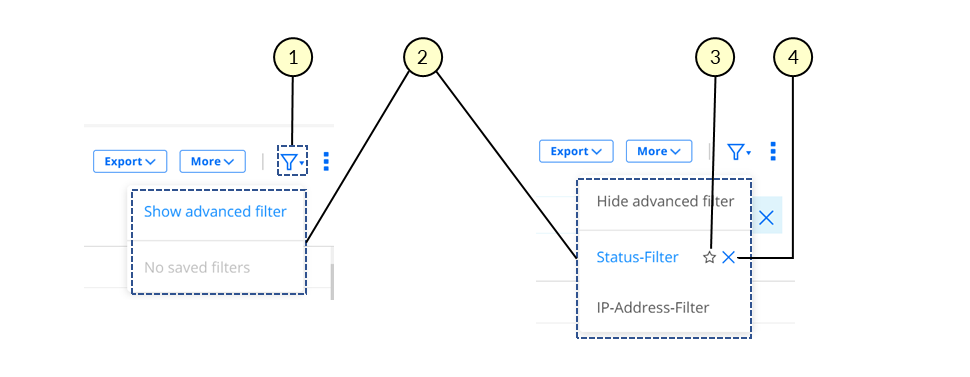
1 — Filter icon and drop-down menu | 3 — Mark as default icon |
2 — Expanded filter menus | 4 — Delete filter icon |
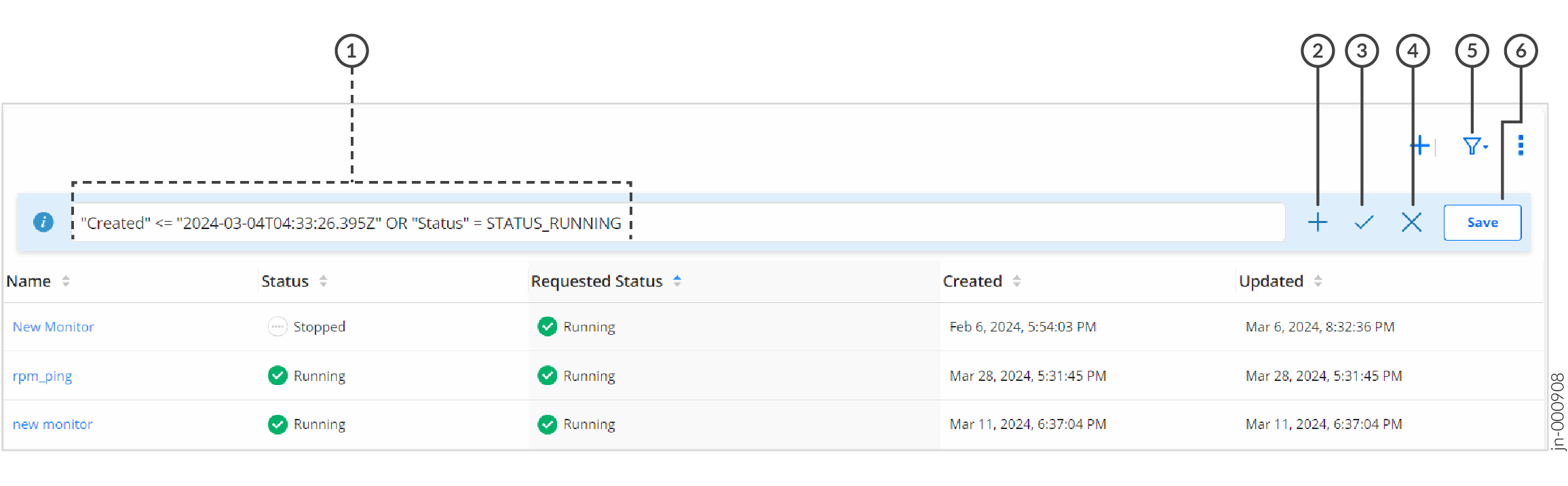
1 — Filter criteria applied | 4 — Clear all filter criteria icon |
2 — Add filter criterion icon | 5 — Filter icon and drop-down menu |
3 — Apply filter criteria icon | 6 — Save as filter button |
| Function | Description |
|---|---|
| Filter criteria field (text box) | This field (text box) displays the filter criteria that was previously specified. You can enter additional criteria by using the Add (+) icon. |
| Add criterion icon (+) | Click the + icon to add a filter criterion. For details, see Add Filter Criteria. |
| Apply filter criteria icon (✓) | Click the check mark icon (✓) to apply the filter criteria that you specified. The filtered data is displayed in the table. |
| Clear all filters icon (X) | To clear all the applied filter criteria and display unfiltered data, click the X icon. |
| Filter icon (funnel) and drop-down | Hover over or click the filter icon or the down arrow button to access the menu to toggle the display of filters and access previously saved filters. See Figure 6. |
| Save filter button | To save the filter criteria so that you can reuse it later, click Save and follow the instructions in Step 5. |
Add Filter Criteria
To add one or more filter criteria:
-
Do one of the following:
-
If no filters are present, click the filter (funnel) icon and select Show advanced filter (see Figure 6).
-
If one or more filters are already present, click the Add (+) icon above the table (see Figure 7).
A page appears displaying the fields related to filter criteria.
-
-
Configure the fields as described in Table 6.
Note:Fields marked with an asterisk (*) are mandatory.
-
Click Add.
The data in the table (grid) is filtered based on the criteria that you specified. The filter criterion appears on the top of the table (grid).
-
(Optional) Do one of the following:
-
(Optional) To save the filter criteria so that you can reuse it later, click Save.
The Save Filter page appears.
-
Enter a name for the filter in the Name text box.
-
To set the filter as a default, click the Set as default toggle button.
Note:- When you set a filter as a default, Paragon Automation automatically applies the filter on the page, and displays the filtered data.
-
Click OK.
A confirmation message appears indicating that the save operation was successful.
You can access saved filters using the funnel (filter) icon.
Note:Saved filters are stored in the local storage of the browser that you use to access Paragon Automation. If you clear your browser's local storage, the filters are cleared.
-
| Field | Description |
|---|---|
| Operator |
Note:
This field appears only when you've already entered one filter criterion and want to enter the second or subsequent criteria.
|
| Field | Select the field (parameter) that you want to use as a filtering criterion. For example, on the Sites page, you can select Name, Country, or Address as a filtering criteria. |
| Condition | Select the filtering condition that you want to use in the filter. A filtering condition can be:
|
| Value | Specify one or more values (depending on the condition that you specified) on which to filter the data. |
Apply a Saved Filter
To apply a previously saved filter:
-
Hover over or click the filter icon (funnel).
The Filter menu appears.
-
Click the filter that you want to apply.
The filtered data is displayed in the table.
Mark a Saved Filter as Default
To mark a previously saved filter as a default:
-
Hover over or click the filter icon (funnel).
The Filter menu appears.
-
Hover over the filter that you want to mark as a default and click the star icon that appears next to the filter's name.
The star icon is shaded (filled), which indicates that the filter is now a default. The next time that you access the page, the default filter is applied and the filtered data is displayed in the table.
Delete a Saved Filter
To delete a previously saved filter:
When you trigger the deletion of a filter, it is deleted immediately. You cannot recover the filter. So, ensure that you check the filter that you want to delete before triggering a delete operation.
-
Hover over or click the filter icon (funnel).
The Filter menu appears.
-
Hover over the filter that you want to delete.
A delete icon (X) appears next to the filter name.
-
Click the delete (X) icon.
The filter is deleted. If the filter was previously saved as a default, then the filter is no longer applied on the page.