Meeting Insights
Use the Insights dashboard to view information about Zoom and Microsoft Teams meetings.
Finding the Meeting Insights
The Meeting Insights section appears on the Insights page when a you select a site, client, or wired client as the context at the top of the Insights page.
The Meeting Details section appears when you select a client or wired client as the context.
This feature is in Beta release.
Meeting Insights Charts
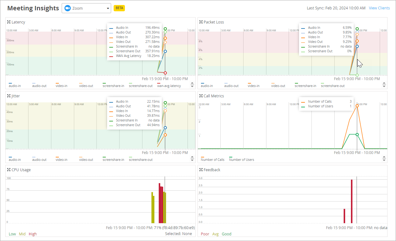
This section shows charts for latency, packet loss, jitter, call metrics, CPU usage, and feedback.
At the top of this section, use the drop-down menu to select the type of meeting to view.
Hover over a point on a chart to see the details in a pop-up message or in a line of text below the graph (depending on the type of chart). The charts are all synchronized to show the details for the selected point. In the example below, the mouse pointer is hovering over a point on the Packet Loss chart. All charts show details for that same point.
Meeting Details Table
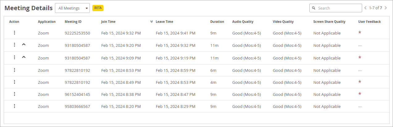
The Meeting Details table appears only when a wireless or wired client is selected as the context.
If you're viewing Meeting Insights with a site as the context, you can go to the Client Insights page by clicking the View Clients link.

After you select a client, the Insights page reloads with that client as the context. You can then scroll down to see the Meeting Insights and Meeting Details for the selected client.
Details include the meeting ID, the join and leave time, and the quality ratings for audio, video, and screenshare.
In the Actions column, you can:
-
Troubleshoot—If you have a Marvis subscription, you can click the ellipsis button to get troubleshooting help from the Marvis Conversational Assistant.
-
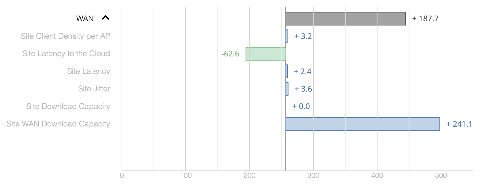
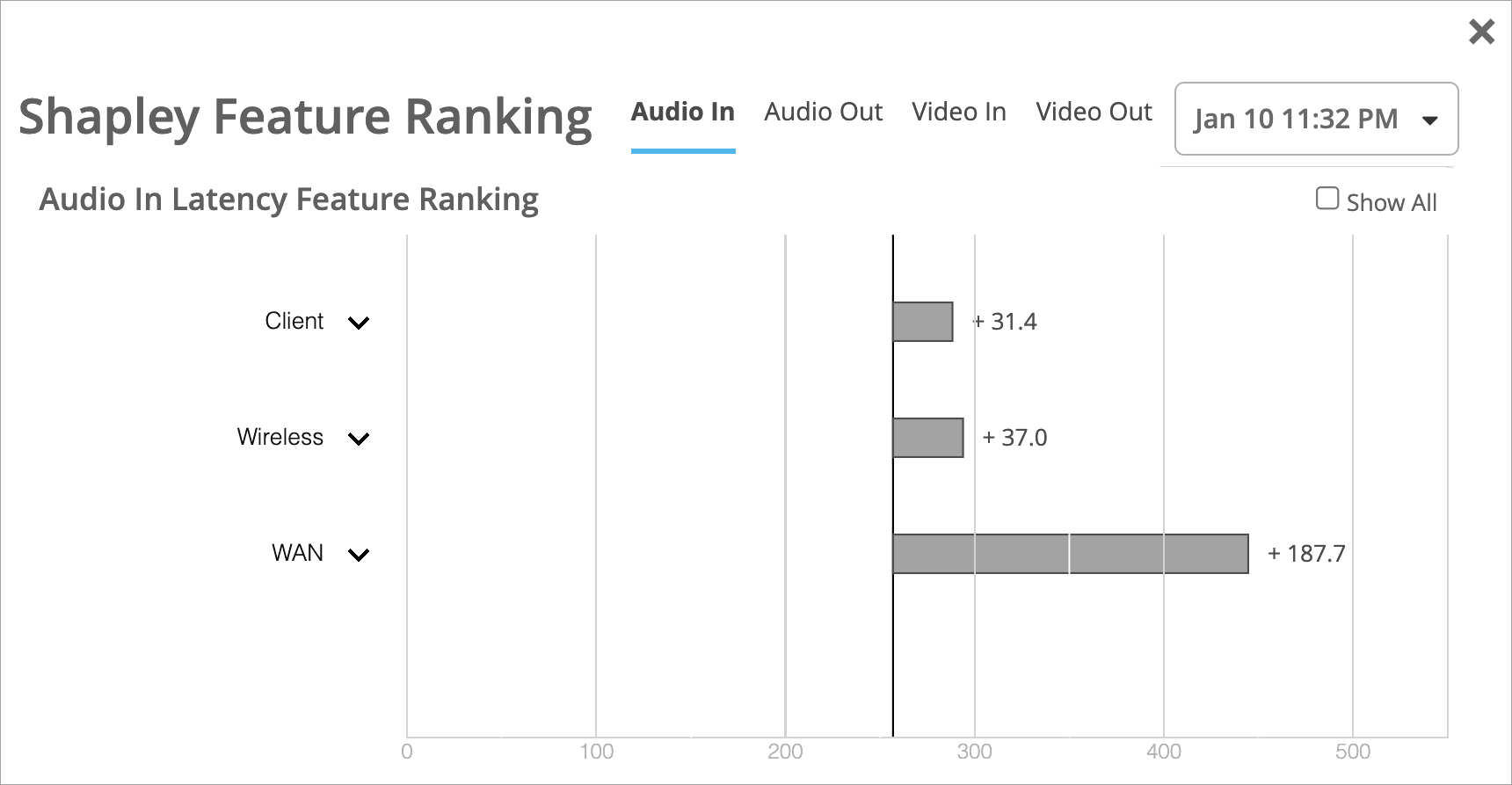
View the Shapley Feature Ranking—A carat ^ icon appears if a user reports a bad experience. Click the ^ icon to view the Shapley Feature Ranking.
Shapley Feature Ranking Example
This example shows how you can use Shapley feature ranking to discover the root causes of poor user experiences. In this example, WAN has the largest latency as compared with Client or Wireless.
You can click the down-arrow to expand the WAN section, as shown below. Now you can see which factors contributed to the high latency for WAN. The Site WAN Download Capacity was the major issue.