ON THIS PAGE
Wireless SLEs
Use the wireless service-level experiences (SLEs) to assess user-impacting factors such as throughput, signal strength, roaming, and more.
Overview
- Wireless SLEs Video Overview
- Finding the Wireless SLEs
- SLE Filter Buttons
- Success Threshold Settings
- Wireless SLEs Video Deep Dive
Wireless SLEs Video Overview
Watch this short video to get a quick overview of Wireless SLEs.
So let's dive into it. Our core functionality for the network management platform is around user service level expectations. So every user, every minute we collect the data to answer the simple question, are users able to connect and are they having a good experience? So what you see here is the site level, this is our global headquarters here in Sunnyvale, the entire site's wireless experience.
So we could take this one level up and essentially show you where all the sites around the world from their service level expectations are doing. And you could take this one step further on understanding the successful connect experience and see which sites are having certain issues. You can understand coverage, roaming.
We've introduced some really cool roaming metrics this year around signal quality and stability of roams, all this kind of stuff. This is on the wireless side. This is the org level service level expectation view that we talk about.
Now, the next core function for our platform is around understanding the experience and taking it down and saying, who all are impacted? And once you know which devices are impacted, being able to go into an individual device. Here, I've zoomed in to a specific device and that specific device, we're showing you now service levels for that individual device. Every device, every minute, we have the data and being able to zoom in to a certain time and say,why was that device not having a good experience? Aha, it's DNS failure.
The device wasn't having good roaming experience. Aha, it's signal quality. Every user, every minute, service levels.
Then you can go in and say, okay, I want to understand this particular device and go into that individual device's experience and see what are the specific signals? What are the specific failures we see for this device? And there's lots and lots of DNS failure for this particular device. Being able to get to that kind of level and specificity of detail with just a couple of clicks, that's the power of the MIST dashboard at a operations level, at a configuration level as well.
Finding the Wireless SLEs
Select Monitor > Service Levels from the left menu, and then click the Wireless button. The wireless SLEs appear below the Users and System Changes timeline.
-
Your subscriptions determine which buttons appear.
-
At the top of the page, use the drop-down menus to set the time period and context (organization, site, or device).
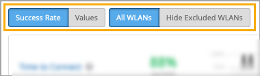
SLE Filter Buttons
Filter buttons appear above the SLE blocks.
-
Use the buttons on the left to show Success Rate or Values.
Use the buttons on the right to show All WLANs or Hide Excluded WLANs. The "excluded" WLANs are those that you've excluded by using the Wi-Fi SLE option in your WLAN configuration.
Success Threshold Settings
You can adjust the thresholds that determine success or failure. To do so, click the Settings button at the right top corner of the wireless SLEs section. In the settings window, follow the on-screen instructions to set the threshold.
Wireless SLEs Video Deep Dive
Watch this 37-minute video to explore wireless SLEs in depth.
So everyone does client health now, as far as the marketing literature is concerned, but service level expectations are about user experience, not just client health. So we measure 150 different states about wireless clients every couple of seconds, and we translate this into seven different service levels, which are user experiences rather than base RSSI levels. We build baselines and thresholds by understanding what is normal on each individual access point at each individual site, and we do this through a whole complex set of machine learning and AI.
Customers get to define the expectations, rather than having to manually set thresholds, the AI does the rest. The setup time for all of this is a few seconds, so let's have a quick look at Mist in comparison with the competition. So here we can see on the right hand side the Mist cloud, and it is a fairly complicated environment, but this is all managed as a service by Mist.
So the customer's view is a simple web GUI that takes around five minutes to get up and running, to get access points connected, a basic configuration put on, and clients starting to use the system. From the moment the first client and the first access point connect to the system, it begins its learning process to understand the normalities of this site. And more importantly, once it's understood those normalities, to be able to spot any deviation from that normality and report that to the rest of the system.
So let's look at these 150 things that we claim we collect every couple of seconds. So these are broken into two main groups. I'm not going to read all of them out, but you can see them there on the screen, and this is available through the GUI as well.
So from an access point of view, we break it down into positive, neutral, and negative events. So positive events are things people connecting, things being configured, and things being claimed and upgraded and all those sort of things. Neutral events are basically things that are getting information.
So they're not a good or bad, they're just reporting information. And then the negative events are things going wrong. So DFS events, DHCP failure events, man-in-the-middle attacks, reflection, network traffic reflection, great for picking up spanning tree loops.
So these are the sort of information we're gathering from an access points perspective. On the right hand side, we can see on the client perspective, we gather even more information. So here we can actually understand any roaming issues.
We can see, again, we've got positive, neutral, and negative events. So a client associating or roaming successfully is a positive event. Whereas a client actually being deauthenticated or roaming away from the network, it's not positive, it's not negative, it's just one of those things that happens.
And then we have the negative events, such as authorization failures, key failures, DNS failures, DHCP failures. And this is just some of the data that we gather about the system. And this is the data you can turn on and off.
There's a whole section of data underneath this on signal strengths and other such things that are gathered regardless. So we don't gather all of these events every two seconds, of course. We gather the relevant piece of information from each client every two seconds.
So what does this lead to? Rather than having all of this information shown about 150 or as many clients as you have on the network, say you had 10,000 clients, each with 150 different states, that would be a very difficult thing to display in a useful way. So these get translated into the service level expectations. We'll go into these in a lot more detail in a moment, but just to give you a really high level of what these are about.
So time to connect. So this is the end user's experience of saying, I want to connect to the wireless LAN and then hitting the internet, i.e. hitting the default gateway. So a number of things happen between those two points in time.
But what this metric is all about is understanding the delta between those two points in time, because that will give a very good indication of that end user's experience. Now, if that's a DHCP issue or a DNS issue or an authorisational authentication issue, that's to some extent less important. It's more about understanding how that's impacted the end user's experience.
Because if a DHCP server fails to provide an address a couple of times, but it still manages to do that in a very short period of time, then that's not an issue for the end user. The end user wouldn't notice that because they still connected within the time. If we look at throughput, trying to understand throughput on a network is almost impossible because it's entirely dependent on the mix of clients.
Each client has a different set of capabilities and each client may be a different distance from the access point. And as the distance increases, the data rate reduces. So the throughput of an access point or of an entire wireless network is very difficult to measure.
And what we're doing here is measuring that every minute. And this isn't measuring the actual throughput. This is measuring the theoretical throughput.
So this is an important differentiation. It's very easy to measure how much data has gone through a network. What this is measuring is how much data could have gone through that network based on the number of clients connected to the access point.
So we'll cover that in more detail in a moment. Roaming performance. Obviously, moving from one access point to another has been the bane of our lives as far as getting wireless networks to perform for voice and video. We're now in a position where 82.11r is pretty awesome. It can do the roaming in single digit milliseconds. So we can then set a different target for roaming than we would for an initial connection.
And typically, we set this at 0.2 of a second or 200 milliseconds. The system will then show us exactly how many devices are hitting that target and how many devices are missing. And more importantly, it will do root cause analysis on those failures.
So you can see here, we failed 4% of the time because we had a 96% success rate. And 100% of those failures were based on standard roams. A standard roam typically will take half a second at least.
So anything doing a non-enhanced roam will always fail this particular metric. But those are devices you want to update and get rid of as far as the performance is concerned. Successful connects measures the devices that didn't get onto the network at all.
So in the timed connect metric that we covered a moment ago, everybody got onto the network, just some of them took longer than the threshold that was defined. In the successful connects metric, these are clients that failed to get on. So you can see the classifiers on the right-hand side, DHCP authorization and association.
So if a client never gets a DHCP address, if it just fails and eventually times out, the end user will be told by the client, I failed to connect to the wireless network. Won't mention the fact that it was a DHCP issue. But of course, we track this.
Now, this is absolutely essential for IoT devices. If a device doesn't connect that has a human on the other end of it, the human is going to complain. If the device that is failing to connect is an IoT device, no one may ever know. That's why it's really important we track these. Coverage validation on every packet. Every time we receive a packet from a client, we measure its received signal strength.
We'll go into that in more detail in a moment. Capacity is understanding how much of the RF spectrum is available to you as far as the network is concerned. So this is looking at Wi-Fi interference, how many clients are trying to use the air at the same time, and also non-Wi-Fi interference.
And then the last one is AP uptime. This is really looking at how long the APs have been connected, if they've had reboots, if they've just been disconnected from the cloud, but still maintained connections themselves. And you'll see that there is some logic and intelligence built in here.
For example, if 20 APs all failed at exactly the same moment and they were all connected to the same switch because we understand the LLDP source, then we're not going to say 20 APs rebooted. We're going to say a switch went down. So equally, if 500 APs disappear off the network at exactly the same moment and they're all the APs on a particular site, the system will work out.
And rather than sending you 500 emails about APs going down, you'll get an email saying the site went down. So this is the high level of the service level expectations. But if we just scoot back for a moment onto that coverage one, this is a really important metric because we do a site survey when we install a system. Of course we do. That's exactly the right thing to do. The trouble is the system will then be live for five to seven years and the environment will change.
The client base will change. The number of clients will massively change. So that coverage model that was accurate for that 20 minute segment, day one of the network being installed, needs to be updated.
And of course, we can't suggest that you do a site survey every week. So the system is effectively doing that for you. Now, in other segments of this training, you'll understand more and more about allocation services.
But for this part of the training, let's assume we can locate clients pretty accurately. So if we take that coverage metric and we understand every client and the signal strength of every client as it transmits a packet back to the network, we can plot that on the map of the site. And each one of these dots on the site are actually showing an average and maximum RSSI.
So you can see very clearly where the blue spots on the network are. In this case, this is our office in the US and you can see the blue parts are very much the car park. We can drill down to a huge level of detail on this to understand the received signal strength from the client back to the network on a square by square basis around this building.
So if someone's having a problem in a particular area, you'll rapidly see that area start to go blue. Now, this is measuring the signal strength of the client as heard by the network, which is very different to what is done in a site survey. In a site survey, you're measuring the power of the access point as heard by the client.
So this is very much the worst way of measuring things because it's always going to have a lower reading, but it's a much more honest way. If an end user is not receiving a telephone call correctly on their mobile device because they keep it in their pocket with their keys all the time, that mobile device is going to be sending a very weak signal back to the network and this system will actually pick that up. That's not ideal.
Everyone should have their mobile phones held out in front of them as per a site survey laptop at all times, but we know that's not the reality. So understanding the end user's experience as far as signal strength is concerned gives us a much better indication of overall user performance. Right, enough of the slideware.
Let's move over and have a look at a live system view. We have a limited amount of data to play with because everyone's away from the offices. So we're going to have to just work with the data that we have.
Here we can see the service levels of our office in the US and here we can see the service levels of the demo system that you might have access to. So we'll start on this one. If we look at the top here, we can see the number of users connecting to the network over the last seven days.
So you can choose how long you want to look at this data for. And it's interesting to see this number of users because this can immediately show a big issue if there's a large drop in users. Typically this happened between 5 and 6pm so probably everyone went home.
The green triangles you see here are radio changes on the network. So again, you can see if a radio change had an impact because this line moves all the way down the network. The blue ones are the configuration changes.
So here someone changed the threshold to four seconds for the SLE of time to connect. So we can see that change was made there and we can see that that had an impact on the time to connect service level here. So if we look at the time to connect service level beforehand, we can see that information and we can choose any time frame that we want or we can just simply go for the last seven days.
We can also choose what information we get to see here. So we can actually choose which one of these pieces of information we actually show on these triangles. The settings part of the service levels allows us to define the individual service levels and where the thresholds are set.
So time to connect is currently set at four seconds as we can see here. What does that mean? So that means that if the whole process of association, authentication, DHCP requests, DNS lookup and arping the default gateway, if that whole process happens within this four second timescale, we just mark it as a pass and move on. So all of this traffic that's happened here, we don't care about it, but it doesn't matter because it's met the service level that the customer has specified.
Anything that's taken longer than that, i.e. everything to the right hand side of this slider, will have root cause analysis run on that automatically to understand why those clients took longer. So let's have a look at the rest of the SLEs while we're in here. So throughput.
This is specifying a target throughput for every client on the network. So we're saying that we want every client to be able to, in theory, achieve 80 megabits per second. So if that client is an 11G client that is only ever going to connect at 54 megabits per second, for example, it would always fail this metric.
But if this client, the client is an 11AC client or an 11AX client, then it would potentially always pass this metric. However, if that client is in the coffee shop down the road, hanging onto the signal at the very low signal rate, then it may drop down to even low as six meg and therefore would fail the metric. So this is the problem.
This is the complexity we're trying to deal with. Understanding what is a good connection as far as both the distance from the AP and the client capability. Looking at roaming, you can see here we've got a target set of 0.2 of a second and this is running at 94% success and the failures are out here at one to two seconds and those will be the traditional non-enhanced roaming, what's called the standard roams, the older clients.
Successful connects, we don't allow you to set a threshold for successful connects, mainly because we assume you want 100%. We don't generally build in a level of failure of clients not connecting to the network. Coverage allows us to set the signal strength of the received signal strength from the client's perspective.
Now, of course, these are negative numbers, so it's all a bit round the wrong way, but effectively, these clients are the successes and these clients are the failures, even though the numbers high, it's a negative. So I'm sure you all remember that from your basic RF. Looking at capacity, this is defining how much of the band should be available at any one time, at any part of a user minute.
So here we can see, typically, there's between 30% and 70% of the band available. So the blue information behind is the last seven days that's been seen. So we've got a target set of 20% of the band should be available at any time.
And we're failing that 1% of the time in this case. AP uptime is looking at AP uptime. And again, we don't allow you to specify a target on this, we assume that you want all of the APs up all of the time.
And we can see that a couple of APs have gone down over the last week. And this is our office testing network, so they're always being rebooted. So once you set your service levels, then the system starts calculating.
And as we saw in this configuration line here, the threshold was changed at this point. So if we look at the information from that point onwards, you'll see that the successful connects figure is changing all the time because it's based on the information that has been gathered for that time slot. Let's go back to seven days.
So there's some important information to know at this point. What you're seeing here is part of the standard wireless LAN subscription. So the standard management wireless LAN subscription will get you what the information you see here.
What you can see also is that we can look at this information from an access point perspective. So we can pick on an individual AP and see the data and the connection successes from an individual AP's perspective. We can also look at an entire organization’s perspective.
And we'll look at this in more detail later. A key point though, is we can drill all the way down to a client level perspective. So we can pick on any one of these clients and see the service levels as experienced by that client.
Now, the client level information is a huge amount of data. And this is covered by the MARVIS license. So if you don't have the MARVIS license for your APs, you won't have access to this client level information. That's just an important point to note. Obviously, the system we're demonstrating on is fully licensed. So I don't want you to be confused about that.
So there is that issue on the licensing. What you can also see here is because of our very small number of clients that are connecting to the network, we've generated some anomalies here. So these areas that you can see here are successful connect anomalies when a number of clients are failing to connect to the network.
Primarily for authorization, we've got a load of clients with the wrong pre-shared key on so we can demonstrate this stuff. This anomaly detection where the system is actually saying this is a big enough change to warrant investigation is actually part of the MARVIS license as well. So there are other things that MARVIS does and we'll cover that in another section.
But we just wanted to make sure that you were aware of what you got as part of the standard wireless license and what you need to add to get for MARVIS to enable. So just wanted to cover those off. One thing you can see at the top here, we've got success rate versus values.
So here we can see 50% success rate. We can go to values and it will show as our time to connect average is six seconds because we've got a lot of clients that are very poor performing. Average throughput is 181.
Average roaming is less than a second. And we can see on average, we're failing to connect. 13 connection attempts are failing.
Coverage is minus 56 dBm and capacity is 52%. So this is interesting, but it doesn't really tell you the whole story. Looking at the success rate is a much better indication of actually what's happening.
And these are very, very unusual figures just because all of the number of people in the office is significant. Well, there's no one in the office. These are just devices that are left in the office for us to play with.
So let's have a look at time to connect in a bit more detail. Here we can see time to connect and we've got these various classifiers. So the classifiers are the things that contribute to the overall time to connect figure.
And here we can see there's been no authorization issues in the last seven days, mainly because there's been no one in the office. There's been no internet services issues. So this is basically, is there enough internet pipe for us to actually do what we need to do? Are we hitting that default gateway? There have been some association issues and there have been some DHCP issues.
So let's have a look at the statistics tab here. And we can see that we have the percentage and also the average. So here we're looking at percentages. We can go to the average metric here and we can see 126 attempts, 96 attempts. We can also then look at the number of users. And here we can see that we bring in a bit more detail now.
So here we can see that eight out of 36 users failed on association. On DHCP, we have to click a bit more detail to understand the different types of DHCP failure. And we can see 29 of the users are failing with unresponsive DHCP and no one's getting nacked or stuck on that DHCP server.
So these three buttons really give you different views of the data because 43% is 43% of all connection attempts. Okay, but what we can see here is that's actually impacting 29 of 36 users. So it just gives you a different way of viewing the various pieces of information.
So let's look at DHCP and let's look at the timeline. So here we can see exactly when the DHCP failures are happening. And on a live system where there's a lot more people connected to the network you would normally see these happen at the beginning of each day.
So if we look at an association problems, for example here we can see, again, when these association issues are happening. We can look at the distribution of these. So here we can now start to see which operating systems are having the issue or which device types are having the issue. And the key part over here is the anomaly detection. So this is looking at what is normal. And normal is based on the last two months of data based on time of day and day of week.
So if today was Monday morning at 10 o'clock then it would look at the performance it's expecting to see on Monday mornings between 10 o'clock and 11 o'clock and predicting that performance and then seeing how that is matched to this anomaly. So when you're coming into a system without knowing the full history of the system this is vital. Because if you see here which devices are actually having the most impact.
So in this case, it's the Sierra devices. And we can see they're actually slightly worse. 1.4 is slightly worse. So 1.0 is exactly the same as it's always been for the last two months. 1.4 is slightly worse than it normally is. 0.8 is slightly better than it normally is.
And we can drill into the individual wireless LANs that are having the problem. So again, you can see if it's only guest devices as your guest wireless LAN that's having the majority of the issues that may cause less alarm bells to ring than if it's the corporate network, for example. And we can then drill down to individual access points and wireless bands that are having the issue.
We can now look at the individual affected items and actually decide which device is having the most problems. So here we can see the Mist AP 12 is actually failing 86% of the time but it's only 4% of the problems. You can see here the Everest device is failing 77% of the time but it's 31% of the problems.
And this device, 50% of the problems. So we can click on any of these to actually see which ones are failing the most and which one's having the most overall impact. So let's pick on a middle one.
Let's go on Everest and see what's happening. So the system will now immediately give us a summary of what's actually happening. So it was slow to connect on 75% of times primarily due to slow association.
It's a client specific issue with mostly happening on this particular wireless LAN and on the five gigahertz band. That's a pretty good first line help desk summary. So we can now look at the insights.
So we can now look at an individual client to actually see what that client's been doing. And here we can see authorization failures. So we're having problems with authorization.
And here we can see PSK failure. Probably it's an incorrectly entered pre-shared key. And the system has already identified that for us but there's a packet capture here that's already been created by the system in order to download that information and actually see exactly what the problem was.
So we can see all the way through this system when there is an issue here, there's a DHCP problem and the client was asking for IP address 000 which clients do. We can see the signal strength. So there's no problem with the signal but the DHCP server kept responding kept refusing a DHCP address because the device kept asking for 000.
And then eventually here we can see it requested an open DHCP address and it got a response and got provided with a DHCP address from this particular DHCP server. So you can see here that the initial DHCP request happened at this point. So 7 minutes and 28 seconds.
And it was 7 minutes and 31 seconds by the time the device actually got a valid IP address. So that's been reported as a slow response from the DHCP server because the DHCP server denied the request so many times in between. So this is the details for a single client.
And a lot of systems will give you some details about a single client. The key point here is we didn't start looking at a client. We started looking at a service level and saw that there was some DHCP issues and drilled into those DHCP issues and found clients that were having those problems.
So we can now drill in here and actually look on these unresponsive DHCP requests who's actually having those problems. And we can see that everyone at some point is having or a large proportion of users at some point are having a problem with DHCP responses. So there is an issue potentially with our DHCP server.
Most of them, it's only a 3% or 4% impact but it is failing a number of times. So immediately we can now say, actually this wireless problem that we're hunting probably isn't a wireless problem. It's a DHCP issue.
Meantime to innocence is one of those things that we like to talk about. And this is a great way of understanding exactly where that problem actually is. So let's move on to one of the other parameters. So let's pick on successful connects because that's kind of related. So here we're going to look at the clients that gave up that they didn't manage to get on. In the previous metric, everybody got on.
It's just some of them took longer than the two or four seconds parameters that was defined. In this case, these clients failed to connect and gave up on that SSID. So here we can now see again, the distribution of this.
We can look at the access points where they're failing. We can look at the device operating systems and we can look at the device types exactly the same way. Now, of course, what you're interested in at this point is the affected items.
And here we can see it's actually only two devices that are having the problem. And we can see immediately, they're failing 100% of the time. And these two devices, I think we can probably guess they've got the wrong pre-shared key.
But we can see here that they're having widespread problems from a DHCP issue. And if we go into the insights page, we can see that they're getting DHCP times out. Okay, so they're not getting an IP address.
So they actually are associating correctly. So it wasn't actually a pre-shared key failure in this case, but the DHCP server is never responding to them. And therefore, they're timing out and giving up on the network.
Again, we could download the packet capture and see those failures. So the great thing is being able to drill into the detail behind these things, you can actually get to the root cause very, very quickly, even if you guess and get it wrong like that. So let's go back into successful connects.
So we can look for anomalies here as well and see if there's any significant anomalies, which there aren't. I mean, there's only those two devices having issues. And we can look at areas where the problems are actually occurring.
So most of the failures are happening here. So we can then isolate where those clients with those particular issues are actually located in the environment. So pretty powerful tool to be able to drill in to understand which clients are failing and why those clients are failing.
So next we'll look at throughput as one of the classifiers. So you can actually jump to any of the service levels from this screen as well. So once we're in, we're looking at this particular site for the last seven days and we can jump around these classifiers inside here.
We don't have to go back to the other screen. Let's look at throughput next. Here we can see that 83% of the time, we didn't hit that 80 megabit per second throughput target that we defined, which is a pretty hefty target due to capacity.
There was simply too many devices trying to access the network. Here we can see coverage was 10% of the issues. So the device was too far away to be able to achieve that 80 megabits per second throughput target that we defined.
And here we have device capability issues. In this case, there was zero of those. So there were no devices that couldn't hit that target, at least in theory. So no 11G devices, for example. And here we have network issues where there wasn't enough internet bandwidth for us in order to be able to achieve that particular throughput requirement. So down here, we can actually see these user minutes.
And the user minutes are actually defining how long, on a permanent basis, we were outside of that threshold target. So each one of these sections you can see here, we break it down. In this case, these are hour-long sections just because we're looking at a whole seven days of information.
We can drill into this in more detail. But between 7 a.m. and 8 a.m., 19 user minutes were lost or didn't meet the threshold, didn't meet the target because of network issues. So a user minute is effectively one minute per device per connection.
So if you have 10 devices connected for one minute, that would be 10 user minutes. If you had 10 devices connected for three minutes, that would be 30 user minutes. One device connected for 20 minutes would be 20 user minutes.
It's just a way of normalizing the user minutes or the user's connections based on the number of devices and how long they're connected. So this gives you an understanding of which one of these individual classifiers is the biggest issue. And we can click on any one of these classifiers and look at that information in more detail.
So coverage, capacity, et cetera. So here we can look at, so coverage, for example, we can see exactly when these coverage issues are happening. We can then drill onto the affected items in exactly the same way.
And we can see which devices are not hitting those targets due to poor coverage. And we can see 41% of the time, this device is dropping below. I mean, an 80 meg target is a pretty high target. So this device wouldn't necessarily have to drop very low before it would actually drop to a lower data rate. Okay, so that's throughput. Let's look on another one and go to capacity.
So capacity is looking at external interference, basically. And we can see in this case, we only have Wi-Fi interference as an issue. And non-Wi-Fi interference would typically be things that are external to the environment, such as radar hits or point-to-point bridge links, video monitors, those sort of things.
So here we can just drill into that, again, the number of minutes that were lost due to Wi-Fi interference. And again, we can see which devices were impacted by that Wi-Fi interference. So again, it's a fairly low figure. We've only got 2% of the time. If you recall, the capacity was set as 20% available. So only 2% of the time was the capacity not above 20%. And we break that, and 100% of that time, it was related to Wi-Fi interference. So we can drill into this and you can see these are tiny percentages. So that's capacity.
Let's look at APUptime while we're down here. So APUptime is really just looking at effectively how many incidents there were of APs either rebooting or becoming unavailable. And we can see we've got three of our 11 access points at some point have had an issue.
We can go into the timeline and we can see here that there was a switch down for a significant part of the week. And we can see here the switch was down here again. So basically they turned the switch off.
And here we've got an AP unreachable for some time as well. So we actually haven't had an access point issue at this point. What we've had is a switch failure. So although the access points connected to the switch obviously would have failed as well, and we can look at the affected items here and see those access points. The main issue that we're actually tracking here is a switch failure, not an access point failure. Roaming is a really critical one.
This is one of the most used troubleshooting tools across the platform. So roaming is understanding as a client moves from one access point to the next access point. This is, as I say, one of the biggest areas of problems in Wi-Fi today.
Sticky clients. There's been lots of terms for it. But effectively, some clients don't like moving from one access point to another. And the quicker you can identify those clients and understand what's going on with them, the better. So in this network, because it's a pretty static environment, because everyone's working from home at the moment, we can see there's only been a few standard roams that have failed the 0.2 second target. We can drill down into that and we can see it's these pies, which are Raspberry Pis.
They're just little tiny clients and they're not brilliant at roaming and they don't do any enhanced roaming. And therefore, each roam that they've done, they failed to hit that target of 0.2 of a second because it takes them around a second to do roaming. Again, we can look at the distribution.
They're all sitting around John's desk. They're all on this wireless LAN. They've all on the five gigahertz band and they're all Raspberry Pis. So all pretty straightforward and we can see when the problem happens. So they obviously did a roam here and they all took too long. It's not a very exciting screen.
I apologize for that. But because we could drill in and see exactly which devices were actually having that problem, we can then go and look at those devices and see if we can improve their roaming capabilities. So the last one really is coverage. And this is really, again, a very important one. We're now in a world where an asynchronous connection is not a good connection. We don't want ADSL anymore.
We want DSL. We want the same upstream as downstream link. And what we're trying to do here is measure not only the signal strength of the client, but also effectively by looking at the data rates of the up and downstream, whether or not there is symmetry in that signal.
So here we can see asymmetric uplink. We can see these two devices have an asymmetric uplink. Therefore, their uplink performance is different to their downlink performance.
But the majority of devices that are having a problem are weak signal. Again, we're looking at a 5% issue here. The average coverage was minus 55.6 dBm. That's a good site coverage. But you will always see this in these sort of networks. People go home and they take their devices with them.
And as they leave the office, their signal degrades. So you always get some weak signal issues. But again, this is what is actually happening to the user. So it's important to measure what is actually happening to the user. Again, we can look at the distribution. We can look at the wireless LANs that are having the issue.
We can have a look at the access points. So exactly the same way. And we can see that 25 out of 42 users are actually having a weak signal at some point, but it's only 5% of all of the user minutes that are actually having this particular issue.
And again, as we looked at before, we can drill into these and see exactly the averages and the number of devices or the percentages. So these are important figures to actually understand what the differences are around that coverage model. So these anomalies here.
So go to successful connects and you can drill into those anomalies and we can see these deviations. Now, this is a tiny amount of data. So if we look at the statistics here, it's only 20 odd users.
So the anomalies are genuine because it's got 100% failure. But it's such a small amount of data and compared to the norm over the last two months, where there'd be 100 odd people in this environment. That's why these anomalies are generating because they're seeing a big difference from the norm.
But each one of these anomalies can actually be seen and tracked. And with a Marvis subscription, MIST will get informed of these anomalies. So we'll actually know these anomalies are happening.
The last bit I wanted to look at is if you have a large organization with multiple sites, then you can view these service levels across all of their sites and you can sort them by the worst ones of each type, etc. So you can see which sites are having the worst problem. And then at an MSP view, you can see each organization and their average service levels across all sites.
So this is just different tiers of information building up on how the actual system is seeing that data. It allows you to drill down at a very granular level to understand from MSP down to organization, down to site, down to access point, down to client. You can see all of that data in a huge amount of detail.
Wireless SLE Blocks
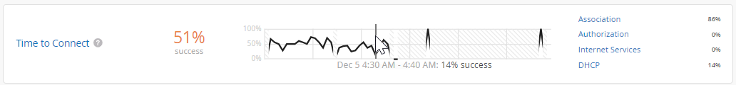
As shown in the following example, each SLE block provides valuable information.
-
At the left, you see that this SLE has a 51 percent success rate. If you select the Value filter button, you'll see a number instead.
At the center, the timeline shows variations across the time period. You can hover your mouse pointer over any point to see the exact time and SLE outcome.
At the right, the classifiers show the percentage of the issues that were attributed to each root cause. In this example, 86 percent of the issues were attributed to Association and 14 percent to DHCP.
-
If you click a classifier, you'll see more information on the Root Cause Analysis page. Most classifiers have sub-classifiers for greater insight into the exact causes. The Root Cause Analysis page also provides additional details about the scope and impact of the issues.
See the following table for more information about the wireless SLEs and classifiers.
| SLEs | SLE Descriptions | Classifiers | Classifier Descriptions |
|---|---|---|---|
| Time to Connect |
Time to Connect is the number of seconds that elapse between the point when a client sends an association packet and the moment when the client can successfully move data. You can click the Settings button to set the number of seconds to use as the threshold for this SLE. |
Authorization | Connection attempts that took significantly longer than the average to pass the authentication state. |
| Association | Connection attempts that took significantly longer than the average to pass the association state. | ||
| Internet Services | Connection attempts that took significantly longer than the average to access Internet resources. | ||
| DHCP |
Connection attempts that were affected by DHCP timeouts. Sub-Classifiers:
|
||
| Successful Connects |
Juniper Mist tracks the success or failure of all connection attempts, including initially connecting to the network, roaming from one AP to another, and ongoing connectivity. The threshold for this SLE is not configurable. It's assumed that you want 100 percent successful connects. |
Association | Connections that failed during the association process. |
| Authorization | Connections that failed during the authorization process. | ||
| DHCP |
Connections that failed during the DHCP process (DHCP timeouts). Sub-classifiers:
|
||
| ARP |
Connections that failed due to one of these problems:
|
||
| DNS | Connections that failed due to DNS failures during or after the connection process. | ||
| Coverage |
Juniper Mist tracks active clients' Received Signal Strength Indicator (RSSI), as measured by the AP. Use this SLE to determine if you have enough APs. You can click the Settings button to set the RSSI to use as the threshold for this SLE. |
Weak Signal | RSSI weakness due to low signal strength. |
| Asymmetry Downlink | User minutes when the AP's signal was weaker than the client's. | ||
| Asymmetry Uplink | User minutes when the client's signal was weaker than the AP's. | ||
| Roaming |
Juniper Mist tracks the percentage of successful roams between access points and assigns a quality score from 1 to 5. A score of 1 indicates excellent roaming, and a score of 5 indicates poor roaming. You don't need to set this threshold. It's assumed that you want very good to excellent roaming, so this threshold is set to 2 and cannot be changed. |
Latency | Excessive roaming time due to latency. Sub-Classifiers:
|
| Stability | User minutes affected by instability of fast roaming (802.11r). This classifier applies when both the client and the SSID are capable of fast roaming but the client experiences slow roaming for more than 2 seconds. This classifier contains one sub-classifier: Failed to fast Roam. | ||
| Signal Quality |
Roaming events affected by weak signal strength Sub-Classifiers:
|
||
| Throughput |
Juniper Mist calculates the estimated throughput on a per-client basis for the entire site. This calculation is done for every client every minute. The estimator considers effects such as AP bandwidth, load, interference events, the type of wireless device, signal strength, and wired bandwidth, to arrive at the probabilistic throughput. You can click the Settings button to set the number of Mbps to use as the success threshold for this SLE. |
Network Issues | Low throughput due to the capacity of the wired network |
| Coverage |
Low throughput due to weak signal strength |
||
| Device Capability | Low throughput due to issues with the device capability. For example, throughput issues can occur if a device only supports 20 MHz wide channels, one spatial stream, or a lower version of Wi-Fi (802.11 g/802.11 n). | ||
| Capacity | Low throughput due to either excessive load on the AP or
interference on the channel. Sub-Classifiers:
|
||
| Capacity |
Juniper Mist monitors the percentage of the total RF channel capacity that is available to clients. You can click the Settings button to set the percentage of the RF channel capacity (bandwidth) that must be available to clients at any time. |
Non-Wi-Fi Interference | Low capacity due to interference from non-Wi-Fi sources |
| Client Usage | Low capacity due to a high client load | ||
| Wi-Fi interference | Low capacity due to wireless interference | ||
| Client Count | Low capacity due to a high number of attached clients | ||
| AP Health |
Juniper Mist tracks the percentage of time the APs are operational without rebooting or losing connectivity to the cloud. |
Low Power | Insufficient power received from the PoE connection |
| AP Disconnected |
Disconnection due to one of these issues:
|
||
| Ethernet |
Ethernet connectivity issues due to one of these issues:
|
||
| Network |
Network-related issues due to round-trip time, packet loss, and Mist Edge tunnel unreachability. Sub-Classifiers:
|